12 Tried-and-True Paint Colors for Your Walls
Discover one pro designer's time-tested favorite paint colors for kitchens, baths, bedrooms and more

Some people know what general paint color they want but struggle with envisioning the exact shade. Others are just scared to commit to color because they’re not sure what works best with their furniture. One of the points about paint I like to make with clients is that the colors you may like may be very different from colors you want to live with.
Some shades translate perfectly to walls. Some, although beautiful, are better saved for fabrics or rugs. Here are some shades of popular, tried-and-true paint colors along with their exact name and brand, that I think translate very well to walls.
Some shades translate perfectly to walls. Some, although beautiful, are better saved for fabrics or rugs. Here are some shades of popular, tried-and-true paint colors along with their exact name and brand, that I think translate very well to walls.
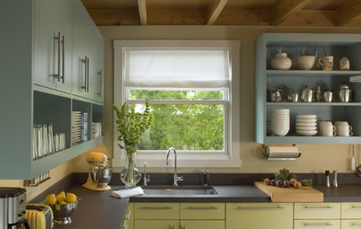
Green. I have long admired the shade of green in this kitchen. I think it's perfectly paired with the white cabinets and does a good job of adding warmth.
This mellow shade of green is Farrow & Ball's Ball Green 75.
This mellow shade of green is Farrow & Ball's Ball Green 75.
Red. When a client asks me to select a red for them, I like to go with a pure, fire engine red. I paint one or two walls and then throw in some more red in rugs or fabrics. I like pairing red with blue or brown as accents.
This hip TV area is painted in Sizzling Haute AC119R by Duron.
This hip TV area is painted in Sizzling Haute AC119R by Duron.
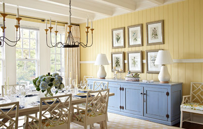
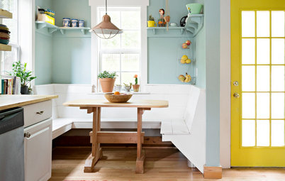
Yellow. One of the trickiest paint colors to get right is yellow, but this shade is just right. A tip for picking a yellow from a paint fan deck: Select something that looks almost beige. Yellow is always much brighter on a wall than on a paint chip.
This sun-filled dining room is painted in Benjamin Moore's Mushroom Cap 177.
This sun-filled dining room is painted in Benjamin Moore's Mushroom Cap 177.
Brown. My favorite neutral color for walls is brown. There are many beautiful shades of brown that are so versatile. Brown works great with orange, green, red and other neutral shades.
I love the use of this distressed cream armoire against this perfect shade of brown, which is Sherman-Williams' Tea Chest SW6103.
I love the use of this distressed cream armoire against this perfect shade of brown, which is Sherman-Williams' Tea Chest SW6103.
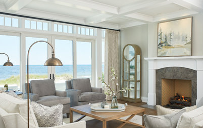
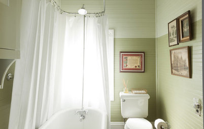
Greige. A made-up color, but important enough to mention because I use it so much. A soft gray with beige undertones that is a perfect complement to most white marbles, such as Calacatta. It's a great solution for those who feel gray is too cold.
This elegant bathroom is painted in my favorite greige, Benjamin Moore's Revere Pewter HC-172.
This elegant bathroom is painted in my favorite greige, Benjamin Moore's Revere Pewter HC-172.
Beige. A basic beige is a must-have for my paint arsenal. I love beige all through the house punctuated with bold color and other neutrals. Loved for its versatility, beige is also a great choice as a backdrop for an art collection.
This elegant entry is painted in Sherwin-Williams' Accessible Beige SW7036.
This elegant entry is painted in Sherwin-Williams' Accessible Beige SW7036.
Lavender. I know some loyal lavender lovers. A soft, barely there shade of this color is gorgeous and looks best with a crisp white trim. I love mixing lavender with robin's egg blue or gray.
These lavender-kissed walls are perfect in Benjamin Moore's Organdy 1248.
These lavender-kissed walls are perfect in Benjamin Moore's Organdy 1248.
Pink. Not just for little girls' bedrooms, pink can be very sophisticated in the right shade. My favorite pinks are soft and purely pink. Pink looks great paired with white, gray, green and blue.
This bubbly pink is called Bella Pink SW 6596, by Sherwin-Williams.
This bubbly pink is called Bella Pink SW 6596, by Sherwin-Williams.
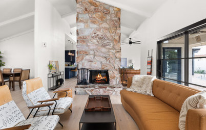
Gray. A popular color for modern and transitional interiors, gray is a unique neutral. I love a soft charcoal gray paired with creamy whites and beige. Try gray with a punch of chartreuse for a surprising combination that really works.
This dramatic great room is painted in Dunn-Edwards' Baby Seal DE 6361.
This dramatic great room is painted in Dunn-Edwards' Baby Seal DE 6361.
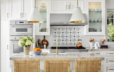
White. White is really one of the most asked-about colors. The perfect white is sought after for cabinets and trim. Undertones in white paint are important and can really shift a palette.
My favorite pure white is White Dove OC-17, by Benjamin Moore. This white, shown here in this gorgeous kitchen, is crisp with no undertones. It looks great against any color.
My favorite pure white is White Dove OC-17, by Benjamin Moore. This white, shown here in this gorgeous kitchen, is crisp with no undertones. It looks great against any color.
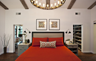
Black. A surprisingly elegant choice for any room, black looks great against most colors. When using black, try contrasting it with crisp white trim and punchy colors in fabrics or rugs. I prefer to see an eggshell finish on walls, and black looks particularly sophisticated in eggshell.
This regal bedroom boasts a beautiful shade of black called Beluga, by Behr.
Your turn: Please show us a room with your tried-and-true paint pick in the Comments below!
More
How Light Affects Your Interior Paint Color
Find interior designers and color consultants near you
This regal bedroom boasts a beautiful shade of black called Beluga, by Behr.
Your turn: Please show us a room with your tried-and-true paint pick in the Comments below!
More
How Light Affects Your Interior Paint Color
Find interior designers and color consultants near you
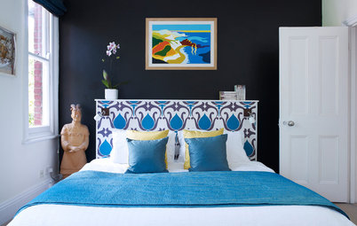
This bedroom is painted in Benjamin Moore's Quiet Moments 1563, which is best paired with a crisp white.