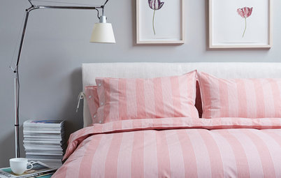
9 Reasons You Don’t Need a Clear-out
Does your home raise minimalists’ blood pressure? So celebrate!

That’s right, celebrate the simple joy of having lots of stuff. Personal mementos, sentimental souvenirs, odd or eccentric collections, plentiful artwork… All these things are, for many of us, what make a house a home.
Of course, too much clutter – quite a different feel – can weigh you down and make you feel overwhelmed and disorganised. Learn how to get the balance just right from the experts, and pick your own reasons for hanging on to lots of your favourite things.
Of course, too much clutter – quite a different feel – can weigh you down and make you feel overwhelmed and disorganised. Learn how to get the balance just right from the experts, and pick your own reasons for hanging on to lots of your favourite things.
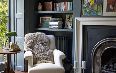
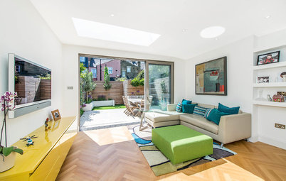
Because you exploit the power of white space
Any graphic designer will be happy to opine on the effectiveness of white – or negative – space. This space is what’s between the typography and the photographs or illustrations and so on.
While certain publications, adverts, product labels and so on require a level of visual busyness to shout about their brand, the more upscale ones will tend to have a hearty respect for the blank bits of a page.
In this scheme, the focus is all about that weighty mantel, heavy with classy vases and pots. Sure, they’re crowded together, but they’re arranged carefully (taller at each end) and what’s around them – note the empty alcoves and the sculptural Juju headdress that blends with the chimney breast – gives them, and the rest of the room, plenty of (white) space to breathe.
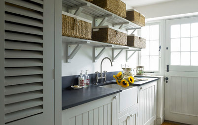
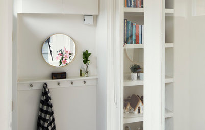
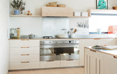
Because nothing’s in the way
The concentration of things on display in this welcoming kitchen is in the ceiling zone, where decorative additions are hung liberally.
There are a few pieces on the deep windowsills, but, importantly, they have space to breathe, are pale – therefore less obtrusive – and don’t block the plentiful natural light.
The console is also ordered (a trio of matching objects always creates a sense of order) and functional (the record player is pretty, but more than decorative). The focal point is, in fact, a pleasingly clear, pale kitchen table, with nothing but a solo centrepiece.
So if you’re struggling for space to show off your bits and bobs, remember to look up.
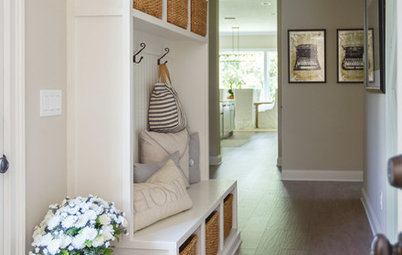
Because you’ve contained your display in one zone
If you’re clever, you can do minimalist and maximalist in the same room.
A pegboard, pinboard, hanging rail or grouping of shelves can all serve to provide a tight location for displays.
Here, the boundary is loose and subtle, and hanging items spill outside the edges. If you’d rather something tighter – say a pinboard, where bits of paper and card won’t edge out into the rest of the wall space – consider having a framer custom-make a deep, glassless structure for you, perhaps using pre-cut cork or cork tiles (widely available online).
Paint the frame and the cork the same colour, then busy it up to your heart’s content, knowing it’ll still feel delightfully ordered.
Because your collection is artwork-worthy
Here’s another way to contain a collection within a designated zone.
If you have a beautiful collection of something that can be arranged or – as here – cut to fit within a fixed shape, the effect can be rather beautiful.
If you have a tile cutter with a diamond blade and are experienced, this could be a DIY job. Failing that, speak to a few local glass and tile specialists, who may be able to point you to an expert who can help.
Again, note how a carefully adhered-to palette really helps.
Buy decorative dinner plates in the Houzz Shop
Because you’ve picked the perfect location
Maybe you’re happy to restrict your collections to one zone or room in your home, with a more minimal approach in other areas. If that’s the case (and even if it’s not), a bathroom or downstairs loo can be a good place to put out your treasures.
You’ll have visitors’ undivided attention, and both rooms are also a bit off the beaten track, so to speak, so can take a bit of a deviation from the style elsewhere.
This pale and interesting bathroom has a restricted neutral palette, which ensures piles of magazines and a busy mantelpiece look artful rather than hectic.
Because you’re very tidy (and have the space)
When London-based interior design practice Avocado Sweets, aka husband and wife team Evros and Susie Agathou, did up their own family home, they packed it with colour and character.
Two things really help when you’ve gone for an explosion of colour and accessories all over the house, as they have. The first is to be scrupulously tidy. A collection can easily become a mess if it’s not kept dusted and thoughtfully arranged, with the rest of the room tidy around it.
A bonus in this house is also that the open-plan area downstairs is airy and spacious. You don’t need huge rooms to house plentiful stuff, but if you have, you’ll find you can get away with more of it.
See the rest of the house here
Because you ‘get’ arranging multiple, small-scale pieces
Picture this collection wobbling on a shelf or sideboard. It’d make you tense just glancing at it and the upkeep would be arduous.
But put tiny objects into their own containers and they feel safe and unlikely to tumble over if you happen to sneeze in their direction.
With something like these colourful retro sweet dispensers, you could consider gluing them into their container.
A printer’s tray with compartments (especially painted to blend with the wall, making the objects within stand out and feel visually cleaner) is another good call if your tiny treasures will fit inside.
Small glass cabinets, too, look good (and will save you much dusting time to boot).
Because you’ve stuck to one colour
If you just can’t resist picking up attractive crockery in junk shops or markets, consider imposing a one-colour rule on yourself.
It’s a simple ruse, but look at the sheer volume of bits and bobs on display in this kitchen and how, while it might not be a look for everyone, the all-white theme means it doesn’t feel as if the walls are crowding in on you.
Painting walls, units and floor the same shade, as here, will streamline the effect excellently. And the pale marble worktops have also been considered in the context of the whole.
If you imagine removing the hanging metal and wood pieces, you can also see how this could quickly go from shabby-chic to almost Zen-like.
Tell us…
What ideas or tips can you share on how to make a home full of ‘stuff’ look good? Let us know in the Comments section.
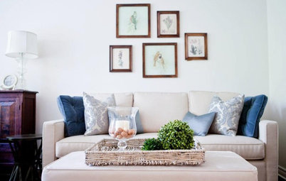
One of the ways ‘lots of lovely stuff’ can veer into ‘cluttered’ or ‘messy’ is when there’s no discipline in the colour scheme.
This busy living room, with its double layer of mismatched cushions (on a lively sofa) and collection of vases could easily get it wrong.
Instead, the design feels ordered, as the two colour themes – one strand of pink/lilac, one of green/blue – are so strong, and follow through in the patterned pieces as well as in the plain colour details. A simple trick – use it liberally!
Find an interior designer in your area and price range