Heavenly Hues: 2018 Dulux Colour Awards Winners Named
The clever and brave use of colour defines the winning designs of this year's Dulux Colour Awards

It takes courage to veer away from safe paint choices but, as these projects demonstrate, the subtle or bold use of colour can affect much more than mere aesthetics. The Grand Prix winner – located in Western Australia’s remote Fitzroy Crossing – used colour to honour local Aboriginal customs and culture, and to reflect the changing landscape through the seasons. Other projects used colour to suspend or move people through space, or to accentuate the movement of the sun.
The prestigious Dulux Colour Awards recognise the most creative and considered use of colour in nine project categories. This year there were more 300 entries from around Australia and New Zealand.
The prestigious Dulux Colour Awards recognise the most creative and considered use of colour in nine project categories. This year there were more 300 entries from around Australia and New Zealand.
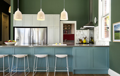
Colour plays an important role in the lives of the people of the valley and the facility uses colour to relate to the surrounding landscape, and the dramatic seasonal changes from the wet to the dry season. In the dry, the country is burnt buff – shades of muted beiges, ochres and the light greens of spinifex, paperbarks, hakeas and eucalyptus; with a counterpoint of dry-season flowers; the bright yellows of cassia and acacia; the pinks of mulla-mulla, turkey bush and kurrajong.
In the wet, the riot of emerald greens, copper, purple and red reach out of the orange earth and surge towards the changing skies.
In the wet, the riot of emerald greens, copper, purple and red reach out of the orange earth and surge towards the changing skies.
We have used wet- and dry-season themes for the colours of each cottage to provide identity and wayfinding, and a full range of the seasonal colours in the west-facing shading screen.
Judges’ notes: The nuanced juxtaposition of contextually inspired hues demonstrates an understanding of the strength of colour and its relevance in the Australian landscape.
Every colour in this project has meaning and, in its remote environmental context as well as its functional context – that
is, the building’s purpose – it is stunning. The architects’ resolved use of colour exemplifies its ability to transform a structure and to generate a sense of place, and the level of sophistication in which it is employed here is exceptional.”
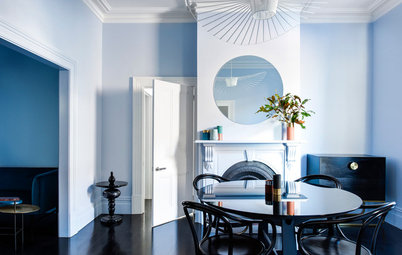
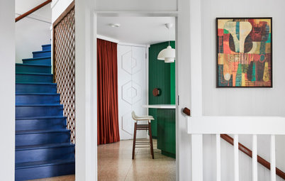
SINGLE RESIDENTIAL INTERIOR WINNER
Project: Percy St
Location: Victoria
Architect: Bagnoli Architects
Photos: Ari Hatzis
Architect’s notes: Lines of sight, light, texture, colour, fixtures, fittings and detailing are custom designed throughout the entire project. The original three-bedroom, one-bathroom Victorian cottage was an important design element to be incorporated into the new home extension; retaining as much of the original design as possible preserved some of the project’s history.
The main living area has one conical skylight, painted yellow, warmly capturing the eastern morning light and a second painted blue, capturing and cooling the north/western light, marking time through the space.
From sunset the LED lights within the base of the cone provide an evening glow. Circular forms define and contain moments through the design.
The design connects the old to the new internally via an interplay of floating built-in furniture versus solid, and rich brass and marble detailing.
Judges’ notes: This entry has
a beautiful energy and innocence. The exploration of colour is soft and serene, yet commanding, and responds to the architectural form rather than being simply applied to a surface. With greys, blacks and splashes of colour, the interior scheme flows seamlessly to the exterior, demonstrating how the consideration of colour in a design concept can add light and depth to a home.
a beautiful energy and innocence. The exploration of colour is soft and serene, yet commanding, and responds to the architectural form rather than being simply applied to a surface. With greys, blacks and splashes of colour, the interior scheme flows seamlessly to the exterior, demonstrating how the consideration of colour in a design concept can add light and depth to a home.
SINGLE RESIDENTIAL EXTERIOR WINNER
Project: Albert Park Curved Pleated Facade
Location: Victoria
Architect: AdeB Architects
Photos: Jaime Diaz-Berrio
Architect’s notes: Albert Park Curved Pleated Facade is a sensitive addition to an Edwardian villa. Additions comprise a distinct two-level extension and a separate complementary garage studio with a central sun-filled courtyard.
The wide side lane presents the project with great visibility and presence. The most successful aspect of the design is the creation of a contemporary home, expressed as a refined composition of a metallic bronze perforated pleated facade within the heritage precinct.
The metallic ‘Deep Bronze Pearl’ powder-coat finish of the pleated facade is a soft counterpoint to the cool grey of the slate roof. The panellised compressed sheet side fence and garage door painted in ‘Western Myall’ mimics the charcoal tones of the rustic and saw-cut bluestone. The rendered walls and trims in the strong tones of ‘Monument’ and ‘Mt Eden’ complete the colour composition. This considered approach underpins our rationale for a distinct yet unified presence of the new additions, for a comfortable urban fit within this desirable heritage precinct.
The metallic ‘Deep Bronze Pearl’ powder-coat finish of the pleated facade is a soft counterpoint to the cool grey of the slate roof. The panellised compressed sheet side fence and garage door painted in ‘Western Myall’ mimics the charcoal tones of the rustic and saw-cut bluestone. The rendered walls and trims in the strong tones of ‘Monument’ and ‘Mt Eden’ complete the colour composition. This considered approach underpins our rationale for a distinct yet unified presence of the new additions, for a comfortable urban fit within this desirable heritage precinct.
The metallic bronze powder-coat finish to the perforated aluminium pleated screens, contained within crisp top and sill plates, provides a rich visual and textural quality to the composition. Sun movement animates the curved facade and the light and shadow effect created by the perforated, pleated profiles accentuates the curved forms of the additions. The changing transparency, shadow and reflective qualities across these surfaces animate the restrained facade internally with a special dappled-light quality.
Judges’ notes: This soft, elegant addition to a heritage home demonstrates an innovative use of colour. The application of Metallic Pearl on the serrated facade is extremely brave – it is usually reserved for trims and small touches – with the result creating a glistening finish of varying tones, depending upon the light conditions, and
contrasting beautifully with the red and ochre brickwork. Importantly, it sits comfortably within the broader external landscape.
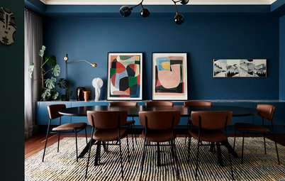
MULTI-RESIDENTIAL INTERIOR
WINNER
Project: North Perth Townhouse Location: WA
Architect: Simon Pendal Architect
Photos: Robert Frith
Architect’s notes: The existing townhouse located at the end of a 1990s reproduction Georgian Mews was tired and unremarkable. The upper floor was a warren of rooms and dark corridors while the ground floor had no spatial presence. Its courtyard had diminished in importance and was filled with building services. We were asked to rephrase the townhouse as a cohesive whole.
Our approach was to consider the townhouse as a sequence of set pieces where daily life is intensified. This evolved on two principal fronts:
- to accept and occasionally embellish the decorative parts of the original (reproduction) interior’s ornate skirtings, ceiling roses, cornices and plasterwork and;
- to intensify these spaces through the use of a single colour per room on floors, walls and ceilings.
Immersion within the coloured rooms – white for bedrooms, emerald green for the kitchen, black within niche spaces and the dressing room, and Prussian blue for the upper sitting room – suspends people and things in singular thick space, correlating a specific atmosphere to intended use.
Transitions between rooms are amplified by vivid colour changes, orchestrating a powerful sequence from one to the next.
The Prussian blue room arose from our interest in making spaces that possess the effect of Chiaroscuro paintings.
Judges’ notes: A clear, concise concept at the heart of this entry separates it from the rest. With bold hues cutting through a base of white, the internal spaces are cleverly defined, while a play of gloss and matt paint finishes adds another dimension to the form. There is no subtlety here;
instead there’s an unwavering commitment to the use of
contrasting tones to delineate the interior.
instead there’s an unwavering commitment to the use of
contrasting tones to delineate the interior.
MULTI-RESIDENTIAL EXTERIOR
WINNER
Project: 5 Sam Sing Street
Location: Victoria
Architect: Collins and Turner with Environa Studio
Photos: Richard Glover
Architect’s notes: The Sam Sing Street residential project includes a mix of apartments and retail, contained within a 20-storey apartment tower and two four-storey mixed-use structures.
The design seeks to establish a new typology for high-density living in the inner-city as a garden tower. The external form of the tower is characterised by the garden voids and a high-performance facade, including external perforated mesh sun shading in a palette of six Dulux powder-coated colours.
The plan orientation angle of the vertical format sun-shading fins also varies subtly, with incidental light and cast shadows creating a seemingly wider range of colours and tones which transform subtly through the course of the day.
Judges’ notes: This project is an example of repetition done well, with the extensive use of colour serving to enhance the architectural form and be distinctive in its context, without becoming a jarring eyesore. The play of light and shadow, solidity and translucency, across the facade is heightened by tonal variation and depth of colour to create interest in what would otherwise be dull vertical planes.
Judges’ notes: This project is an example of repetition done well, with the extensive use of colour serving to enhance the architectural form and be distinctive in its context, without becoming a jarring eyesore. The play of light and shadow, solidity and translucency, across the facade is heightened by tonal variation and depth of colour to create interest in what would otherwise be dull vertical planes.
INTERNATIONAL WINNER
Project: Crimson Education Office
Location: Auckland, New Zealand
Architect: OPL
Photos: Patrick Loo
Architect’s notes: Housed within a 1960s-era warehouse, the project was a small interior office fitout for Crimson Education’s technology teams. Spatially open in planning, the design was conceived as an insertion within an existing brick-and-glass surround with heavy structural steel elements floating above. Colour and material palettes were then used as strong visual linkages to the workstations, storage units and meeting pods contained within.
Inspiration for colour was driven by the red tones of the existing steel protective primer coatings and the poetic way in which this tied in with the client’s name.
Judges’ notes: This interior takes one colour and uses it with discretion and flair to create definition within the
space. The crimson tone highlighting internal architectural elements deliberately contrasts and complements the backdrop of natural materials and shades of white, and the overall effect is clear and cohesive.
Tell us
If you enjoyed this story, like it, save it, save the photos and share your thoughts below. Join the conversation.
More
Take a look at last year’s winners
Project: Fitzroy Crossing Renal Hostel
Location: WA
Architect: Iredale Pedersen Hook Architects
Photos: Peter Bennetts
Architect’s notes: The Fitzroy Crossing Renal Hostel provides a home for Aboriginal people with final-stage renal disease to stay close to their community and family members while undergoing dialysis. The hostel consists of 20 beds over five small cottages with a common amenity building providing indoor and verandah-based activity.
The facility is planned to reflect the different language regions that the residents might come from, and to respond to the cultural and physical environment of the Fitzroy Valley. Fitzroy Crossing is the meeting place of four Aboriginal Language Groups; the river and hill people (the Bunuba); the planes people (the Nyigina); the eastern river people (the Goodiyandi); and the people of the Great Sandy Desert (the Walmajari).