Houzz Tour: A Flat's Contemporary Take on Preppy Style
A genteel mix of patterns and a warm, bold colour scheme renders this home a classic and cosy ambience

“The owners, not wanting to follow local trends, were inspired by American homes with a contemporary approach to a traditional design,” Arjan Nijen Twilhaar, principal designer of Aiden T, says of the young couple who own this Build-To-Order (BTO) HDB flat.
From a design approach, the owners wanted a traditional feel, but with a more contemporary colour palette, so Twilhaar went for “‘Preppy Style’, where traditional architectural detailing gets a bold touch,” he says. Since the flat came as a shell, without the floor finish and doors, and only the kitchen and bathrooms were tiled, the designer and the owners collaborated to create a spacious, timeless and homely abode out of a blank canvas.
From a design approach, the owners wanted a traditional feel, but with a more contemporary colour palette, so Twilhaar went for “‘Preppy Style’, where traditional architectural detailing gets a bold touch,” he says. Since the flat came as a shell, without the floor finish and doors, and only the kitchen and bathrooms were tiled, the designer and the owners collaborated to create a spacious, timeless and homely abode out of a blank canvas.
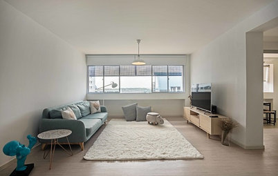
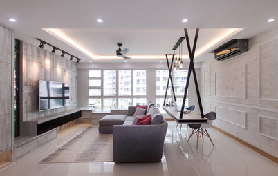
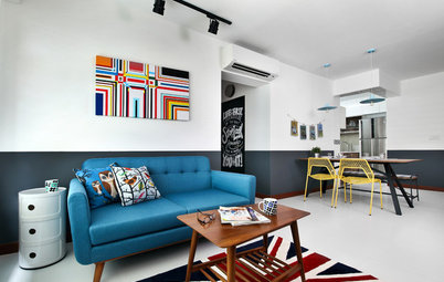
To enhance the traditional feel, Twilhaar chose a simple patterned cornice and accentuated it by adding a 30-centimetre perimeter border. “This extra detailing is especially nice around outward corners and adds another layer of interest to the design. Layering is important to achieve a timeless look with an understated and elegant appeal,” he says. The wall behind the sofa was also adjusted flush under the beam for a neater look.
Twilhaar originally wanted to place a marble slab behind the TV, but went for a more cost-effective large tile. The TV console is mounted behind the wall and the cables are accessible from the back. Elevating the sophisticated look are mirrors on both sides, cut in varied sizes and with a bevelled edge.
“The wall lights next to the TV were a present from the husband to the wife, so he and I picked a design and imported the lights from Denmark. All this while the wife and I were still looking around for the ‘right’ wall light, and I had to ‘reject’ a few designs saying they did not work well with the space, because I knew the lights would come in,” the designer says.
Sofa and side table: Crate and Barrel; side chair: Lush; wall lamps: Danish Design Co
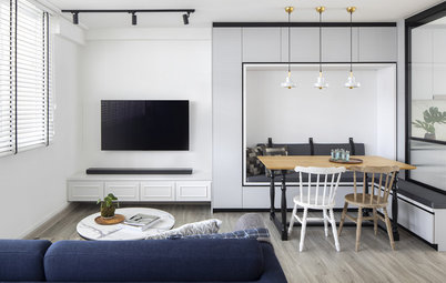
“The couple work from home once in a while, so they wanted a dedicated study, ideally tucked away in order to keep their home neat and tidy,” says Twilhaar. Part of the living room was enclosed to create a study, flanked by French sliding doors that still allow light to filter in. Wallpaper in a trellis pattern was added around the doors for textural interest.
Wallpaper: Cole & Son from Goodrich
Wallpaper: Cole & Son from Goodrich
Two tones of laminate were used in the study – dark walnut for the shelving unit and desk, and white for the outer frame and doors. This helps create depth in a compact space, as well as create a quiet atmosphere conducive for work.
“Of course, designing homes for the tropics requires an understanding of how materials work locally, so it is important that you select materials that can withstand the humidity as well as sudden climate changes, such as when you switch on the air conditioner to cool down a room,” says Twilhaar. “In the living room and dry kitchen, we opted for a loose lay 5 millimetre vinyl flooring. I prefer to use loose lay over the click system, as we have greater flexibility on the floor design and repairs are much easier to execute. In addition, loose lay flooring does not ‘float’ so it does not have that ‘laminate flooring sound’.”
Flooring: Innovar
Flooring: Innovar
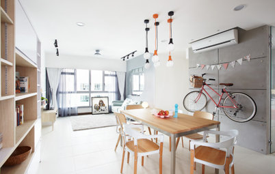
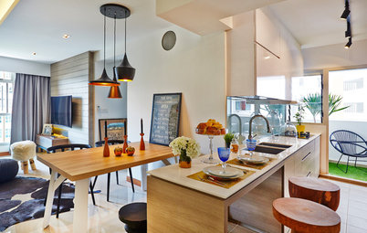
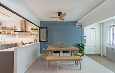
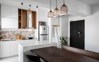
A half-height wall connects the dining area and the dry kitchen, creating an eat-in kitchen. Muted colours complemented by sleek finishes, such as the glossy table top and copper pendant lamps, round off the elegant look.
Dining table: Furniture Club; chairs: Comfort Design Furniture; lamps: Taobao
Dining table: Furniture Club; chairs: Comfort Design Furniture; lamps: Taobao
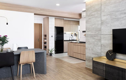
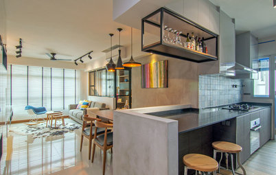
A glass sliding door separates the fully-equipped dry and wet kitchen so cooking fumes can be contained, while still keeping both areas sufficiently illuminated.
“We opted for a traditional Shaker style cabinet, laminated in a dusty jade colour. All my Shaker kitchen cabinets are fully laminated with solid plywood as base, and the interiors are coloured polykem for a finishing touch. In our climate, I prefer to avoid materials like MDF or particle boards, as they tend to get mouldy and expand when moist,” says Twilhaar.
Laminate: Formica; countertops: iQuartz; drawer systems: Blum; backsplash: Hafary
The designer initially wanted to install the same flooring from the living room in the kitchen for a seamless look, but opted to finish the wet kitchen with tiles instead for easier maintenance. Marble-look tiles for the backsplash add subtle texture.
All the interior doors, trims and skirting boards are solid wood. “We added wood trim to the household shelter door to make it blend in with the overall design and changed the metal vent to a plasterboard louvred one for a more integrated look,” explains Twilhaar.
The master bedroom is serene and sophisticated. Metallics take the spotlight in this room, from the art deco print of the wallpaper to the sunburst mirror above the headboard and the gleaming table lamps.
“To avoid the typical HDB feel, we pushed the wall flush under the beams, so the walls are now neat. The space behind the flushed wall is used for the TV cables, and we embedded the TV console in the wall as well, to maximise the space in the room,” the designer says.
The wardrobe is custom-built using matte laminate Shaker doors, and extends to a small vanity area.
Side table and TV console: Ikea; mirror: Nook and Cranny; table lamps: West Elm
The walls in the the baby’s room were pushed out flush to the beams as well, and wallpaper was put up behind the crib. By keeping the style classic and the colour scheme pale, the room can grow with their little daughter and be transformed easily by simply changing the accessories.
Twilhaar opted to keep the original wall tiles in the bathrooms, but replaced the flooring with one in a grey hue for a bit more contrast. The custom-made blue Shaker vanity cabinet with matte gold handles makes for a bold element that adds character to the space.
TELL US
What feature did you like best in this home? Share in the Comments below.
TELL US
What feature did you like best in this home? Share in the Comments below.
Houzz at a Glance
Who lives here: A young couple and their baby girl
Location: Punggol
Size: approximately 1,200 square feet (111 square metres)
Project duration: 3 months
“’Preppy’ finds its origins in traditional homes,” Twilhaar says. Having lived and worked in Boston, the Singapore-based Dutch designer drew inspiration from the Federal-style homes with a transitional/fusion approach. “I also like elements that are surprising or quirky. These could be a colour scheme or objects that can be a talking point. In this case, we opted for a bolder and warmer colour scheme, but still tried to keep it neutral, so the home has a timeless feel,” says Twilhaar.
The design of this home is mainly inspired by US East Coast apartments, which tend to be more formal. He achieved the look through the furniture and accessories, and at the same time, infused a more streamlined, New York vibe through some art deco pieces.