Houzz Tour: A Paris Pied-à-Terre for the Workweek
Designers solve a 280-square-foot ‘brainteaser’ with a function-packed modular layout that’s anything but static

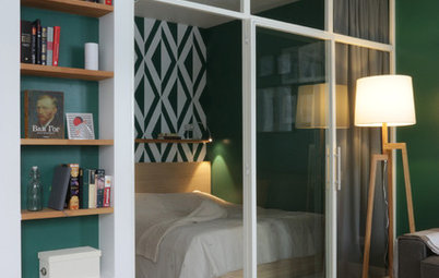
In France, more and more people work in Paris during the week and then spend weekends with their families in the provinces. Hotels and friends’ sofas in the French capital have their limits, and if the situation becomes relatively permanent, it can make sense to invest in a pied-à-terre. This studio apartment in an 18th-century building in Paris’ dynamic Montorgueil district is designed to be just such a crash pad.
Although the studio was rundown, it was also bright and quiet. That it overlooks a courtyard was another bonus. So the owner asked the interior designers at Atelier Daaa, whose projects he had seen on Houzz, to make it over to fit his lifestyle. Three months later, the apartment looked totally different.
Although the studio was rundown, it was also bright and quiet. That it overlooks a courtyard was another bonus. So the owner asked the interior designers at Atelier Daaa, whose projects he had seen on Houzz, to make it over to fit his lifestyle. Three months later, the apartment looked totally different.
Before. The apartment originally had a closed-off yellow kitchen with a black-and-white floor that wasn’t to the new owner’s taste.
The designers opened it up and created a modular but still functional layout.
“We didn’t want a Swiss army knife, where to use one blade, you have to lose another. We wanted all the functions to coexist without the space looking cluttered — despite the small area. It was a real brainteaser,” Guilbault says.
Find an interior designer to make the most of your small space
Before. In addition to the months of planning needed to figure out the best layout, two other factors pushed the cost to about $99,000.
First, the work had its share of unpleasant surprises. “This 18th-century timber-framed building had settled, so the floor had a height difference of about [8 inches] from one side to the other,” Guilbault says. “We had to make it level again by laying a [mortar layer] and a steel deck.
“In addition, we replaced the windows with [double-paned] wooden ones made by a carpenter, swapped the fan heaters for electric ones by Thermor and put in an entire drainage system, which had been missing.”
Second, the design-minded owner chose high-end finishes: solid oak flooring, cement tiles in the kitchen and birch plywood for the woodwork.
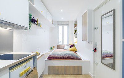
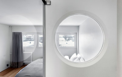
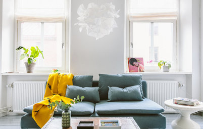
After. The entrance to the studio is just to the left of the kitchen. The small living room is immersed in soft, bright light.
The walls and the floor are finished in a combination of white paint and pale wood, borrowed from Scandinavian style. Black details and geometric patterns enhance the contrasts and lend a graphic touch to the space.
See How People in 13 Countries Interpret Scandinavian Style
The walls and the floor are finished in a combination of white paint and pale wood, borrowed from Scandinavian style. Black details and geometric patterns enhance the contrasts and lend a graphic touch to the space.
See How People in 13 Countries Interpret Scandinavian Style
Cement floor tiles with a labyrinth pattern adorn the entrance, kitchen and bathroom.
The highlight of the living area is this birch plywood panel, which partially separates the living space from the sleeping area.
The partition slides along a track in the dropped ceiling and allows the space to be modified in three ways.
The highlight of the living area is this birch plywood panel, which partially separates the living space from the sleeping area.
The partition slides along a track in the dropped ceiling and allows the space to be modified in three ways.
First, it can conceal the openwork cabinet, which houses the washing machine and the water heater.
Second, it can be moved to hide the passage to the bedroom, located near the headboard. Third, it can cover the bookcase and the TV stand.
“The sliding wall has no technical function, but it brings the space to life by giving it some movement,” Guilbault says. “It’s important to let the occupant of such a small place choose what he wants to see. It prevents monotony.”
“The sliding wall has no technical function, but it brings the space to life by giving it some movement,” Guilbault says. “It’s important to let the occupant of such a small place choose what he wants to see. It prevents monotony.”
The partition, like most of the carpentry, is matte-varnished birch plywood.
The designers at Atelier Daaa like this material especially for its Scandinavian flair and graphic edges, which do not have to be refinished afterward, the way a laminate might need to be, for example.
Although it’s quite heavy, the panel slides easily thanks to a track from Hawa attached to the ceiling.
The bookcase and flat-screen TV module was planned out in great detail. The top is only about 8 inches deep. The bottom contains drawers that house the router, amp, video game console and so on.
“We made the fronts of the drawers in the same pattern as the laundry cupboard. This openwork style has both aesthetic and technical purposes: It provides ventilation for heat-emitting devices and allows you to change channels without having to open the drawer,” Guilbault says.
“We made the fronts of the drawers in the same pattern as the laundry cupboard. This openwork style has both aesthetic and technical purposes: It provides ventilation for heat-emitting devices and allows you to change channels without having to open the drawer,” Guilbault says.
The top of the bookcase has open spaces to make the room appear larger than it is.
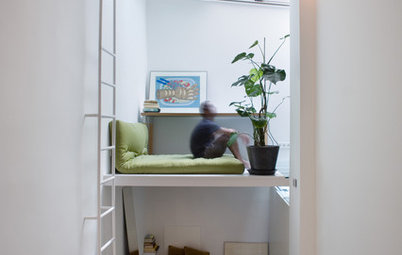
Behind this partition, the bedroom was designed as a sleeping box.
“The difference is that there isn’t really space to move around the bed. Still, this type of alcove is just as comfortable as a real bedroom,” Guilbault says.
The owner can reach the bed from this small passage between the laundry cabinet and the TV.
“The difference is that there isn’t really space to move around the bed. Still, this type of alcove is just as comfortable as a real bedroom,” Guilbault says.
The owner can reach the bed from this small passage between the laundry cabinet and the TV.
Or he can reach the bed from the foot end. This end also serves as a seat for the built-in desk along the wall. The owner can sit facing the window and work while enjoying a view of the trees outside.
“The great advantage of a custom-made layout is being able to create links between separate areas,” Guilbault says.
The well-chosen finishes help unify the spaces. “Just as the tiles at the entrance run straight into the bathroom to create unity, birch furniture here unifies the living room and the sleeping area,” he adds.
The double bed is on a platform to differentiate the zones and gain storage space. “This is the second modular element in this studio, but we’ve worked on the modularity so you don’t lose one function to create another,” Guilbault says.
A carpenter integrated a 55-by-75-inch frame and slats into the top of the 19½-inch-high platform. The structure lifts to reveal a roomy storage space where the owner can keep his luggage.
Find a carpenter for your project
A carpenter integrated a 55-by-75-inch frame and slats into the top of the 19½-inch-high platform. The structure lifts to reveal a roomy storage space where the owner can keep his luggage.
Find a carpenter for your project
A niche at the head of the bed serves as a bedside table. It has a light switch for both the bedroom area and the living space. It also has several outlets for the owner to charge his portable electronic devices.
Several tall cabinets form the closet.
Several tall cabinets form the closet.
Designed to be a continuation of the laundry cabinet, it is about 24 inches deep and has lights inside.
An LED strip placed behind a filler strip gives the bedroom area a beautiful atmosphere after dark.
An LED strip placed behind a filler strip gives the bedroom area a beautiful atmosphere after dark.
The office shelf extends to the end of the living space.
“It was a good way to lengthen the lines of the living room, rework the spaces and add storage,” Guilbault says.
“It was a good way to lengthen the lines of the living room, rework the spaces and add storage,” Guilbault says.
The shelf is wider on the office side than in the living space because the rear facade of the building is slightly angled. This trick makes the room seem more rectangular.
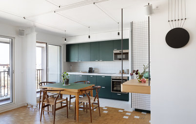
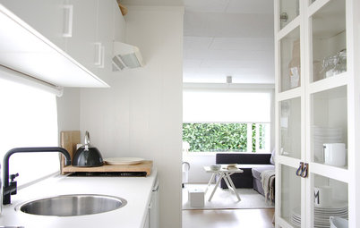
Opening up the living space created room for a 6½-foot run of custom kitchen cabinetry that extends to the ceiling.
The doors have no hardware to create a lightweight feel. The base cabinets are birch with a solid-surface countertop. The top cabinets are medium-density fiberboard coated with a pale gray lacquer.
Upper cabinet paint: San Miguel, Ressource
The doors have no hardware to create a lightweight feel. The base cabinets are birch with a solid-surface countertop. The top cabinets are medium-density fiberboard coated with a pale gray lacquer.
Upper cabinet paint: San Miguel, Ressource
The kitchen does not have a dishwasher, but it does have a combination microwave, an induction cooktop, a small fridge and plenty of storage space.
As in the rest of the apartment, the lighting was carefully thought out.
“The kitchen is lit by three modern ceiling lights, while an LED strip illuminates the entire [countertop]. There’s also lighting in the [range] hood,” Guilbault says.
Lights: SLV
As in the rest of the apartment, the lighting was carefully thought out.
“The kitchen is lit by three modern ceiling lights, while an LED strip illuminates the entire [countertop]. There’s also lighting in the [range] hood,” Guilbault says.
Lights: SLV
Graphic floor and wall tiles liven up the space. The cement tiles with a labyrinth motif are by Swedish brand Marrakech Design.
Browse a wide range of tile
Browse a wide range of tile
The designer placed a round table in front of the kitchen wall.
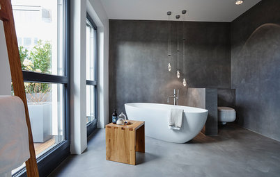
Although the bathroom is about 6 by 4½ feet, it’s efficiently planned out, with a 31½-by-51-inch shower, a toilet and a vanity.
Nothing in this design was accidental. The polished shower base is a cheerful touch, while the contrasting white and black fixtures add to the Scandinavian atmosphere.
Rectified porcelain wall tiles: Revigres; bathroom fixtures: Zucchetti
Rectified porcelain wall tiles: Revigres; bathroom fixtures: Zucchetti
Creating the bathroom was technically challenging because there was originally no water supply or drainage system.
The designers handled the problem cleverly by concealing a lift pump inside a box that serves as a shelf in the shower.
The designers handled the problem cleverly by concealing a lift pump inside a box that serves as a shelf in the shower.
The box aligns with the custom vanity, a space-saving resin model with a ceramic sink.
“Our job was integration, hiding the technical equipment. That’s part of our challenge,” Guilbault says.
“Our job was integration, hiding the technical equipment. That’s part of our challenge,” Guilbault says.
Thanks to Atelier Daaa, the owner now has an enhanced studio with a graphic touch that’s both comfortable and functional. He believes that the cost was well worth it because having a home he can feel good in makes being away from his family during the week a bit more bearable.
More home tours: Apartments | Small Homes | Colorful Homes | Contemporary Homes | Eclectic Homes | Farmhouses | Midcentury Homes | Modern Homes | Ranch Homes | Traditional Homes | Transitional Homes | All
More home tours: Apartments | Small Homes | Colorful Homes | Contemporary Homes | Eclectic Homes | Farmhouses | Midcentury Homes | Modern Homes | Ranch Homes | Traditional Homes | Transitional Homes | All
Apartment at a Glance
Who lives here: A young man whose work takes him away from his family during the week
Location: Montorgueil area of Paris
Size: About 280 square feet (26 square meters)
Designers: Richard Guilbault, Julien Ensarguet and Pierre Petit of Atelier Daaa
In general, small spaces are the most difficult to optimize because the design has to make use of every inch. “Although the space was very limited, it was our job to integrate the same number of functions as might be found in a larger apartment: a bedroom area, a living room, a kitchen, a bathroom and an office. We also had to ensure the space felt open,” interior designer Richard Guilbault says.