
3 foton på modernt vitt kök, med grönt stänkskydd och rött golv
Sortera efter:
Budget
Sortera efter:Populärt i dag
1 - 3 av 3 foton
Artikel 1 av 5
 Mars Avril
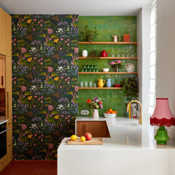
Tournant le dos à la terrasse malgré la porte-fenêtre qui y menait, l’agencement de la cuisine de ce bel appartement marseillais ne convenait plus aux propriétaires.
La porte-fenêtre a été déplacée de façon à se retrouver au centre de la façade. Une fenêtre simple l’a remplacée, ce qui a permis d’installer l’évier devant et de profiter ainsi de la vue sur la terrasse..
Dissimulés derrière un habillage en plaqué chêne, le frigo et les rangements ont été rassemblés sur le mur opposé. C’est le contraste entre le papier peint à motifs et la brillance des zelliges qui apporte couleurs et fantaisie à cette cuisine devenue bien plus fonctionnelle pour une grande famille !.
Photos © Lisa Martens Carillo
 Studio XM
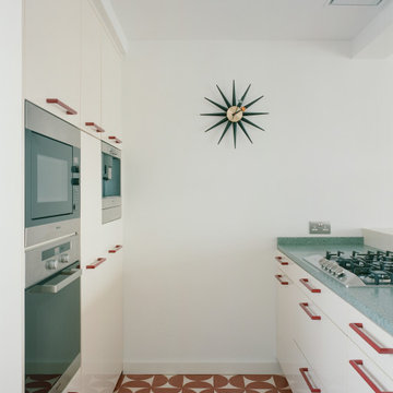
With our limited budget it would have been too costly to replace the kitchen entirely - and the end product would have only been marginally better. The finishes were our playground, but not without constraints. The cabinet doors were lacquered, limiting our options for new colors on those surfaces. However, the handles were easily replaceable. To contrast the relatively desaturated color of the cabinetry, we opted for vivid red plastic handles with a rounded profile. Their color, shape and profile was inspired by HEWI’s designs from the 1980s, bringing in some much needed frolicsomeness.
The half-circles on the floor tiles alternate between clay and beige, weaving together the timber floor boards leading to the kitchen and the cream cabinet doors enclosing it. Those same tiles were used as skirting where possible.
The countertop is a dark-green marble cement agglomerate. It uses recomposed stone and resembles terrazzo. The contrast in color creates a balance that was sorely lacking from the existing monochrome kitchen.
 Studio XM
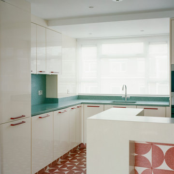
With our limited budget it would have been too costly to replace the kitchen entirely - and the end product would have only been marginally better. The finishes were our playground, but not without constraints. The cabinet doors were lacquered, limiting our options for new colors on those surfaces. However, the handles were easily replaceable. To contrast the relatively desaturated color of the cabinetry, we opted for vivid red plastic handles with a rounded profile. Their color, shape and profile was inspired by HEWI’s designs from the 1980s, bringing in some much needed frolicsomeness.
The half-circles on the floor tiles alternate between clay and beige, weaving together the timber floor boards leading to the kitchen and the cream cabinet doors enclosing it. Those same tiles were used as skirting where possible.
The countertop is a dark-green marble cement agglomerate. It uses recomposed stone and resembles terrazzo. The contrast in color creates a balance that was sorely lacking from the existing monochrome kitchen.
1