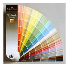
Paint color consultant, worth it?
I need to paint the interior of my entire house.
I heard many many horror stories from people about how their paint color turned out to be completely different than what they thought they were getting.
My house is 3500 sq with 5 bedrooms, an office, a living room, a dining room, a kitchen and a foyer.
I am not planning to get an bold colors. Just neutral beige, greige... etc, except for 2 two bedrooms for kids.
Should I hire a paint color consultant? The one I talked asked $500 for service.
Is that reasonable? I live in IL.
Kommentarer (27)
 newproject858 thanked Yayagal
Suki Mom
5 år sedanI have found that the people who work at Benjamin Moore are very helpful in picking colors.
newproject858 thanked Suki Mom
sheloveslayouts
5 år sedanI totally agree with the Cook's Kitchen. People often assume that a neutral is easy, but it's not.
For me, I painted and repainted rooms because the beige or greige just looked off and it bothered me. I then started to learn about undertones. Aha! The Rice Grain that everyone loved at the time had a slight green undertone that was conflicting with the stain on my wood floors.
The time an money I wasted on disliking my walls and repainting is easily worth $500. If you get a good consultant :-)newproject858 thanked sheloveslayoutsJo
5 år sedanAgree with Suki - I have found people at the Benjamen Moore store to be very helpful. Bring in pictures of your home. If you are not sure after this then look for a consultant. Some of the benjamen moore stores also have consultants you can hire.newproject858 thanked Jo
ocotillaks
5 år sedanAs a quilter, I'm used to dealing with undertones and figured out the paint system quickly.
newproject858 thanked ocotillaks- newproject858 thanked sheloveslayouts
 PRO
PRORebecca Quandt Interiors
5 år sedanI think that $500 is pretty high for a paint consultation. I would charge somewhere closer to $150-250.
If you want to try it yourself, you can, but it may be a bit more time-intensive process than hiring a professional, but less expensive. Here are my detailed advice/thoughts to enable you to DIY. (Yes, it's long, but I want to equip you with everything I know as a professional so you can do it right and hopefully not get frustrated. Hopefully the description doesn't scare you away from the process - I believe in you!)
You can also scroll to the bottom and I left some color suggestions for you (but I recommend reading all the instructions).
SELECT YOUR COLOR SAMPLESMy single most important piece of advice is to buy samples and try them on your wall before you commit to a color and paint the whole room. Sample paints are typically $4 each and while purchasing lots of samples feels like it adds up, it's still cheaper than painting an entire room the wrong color and having to redo it.
It is VERY true that colors look one way in the store and completely different in your home (The reason is stores typically use fluorescent lighting and your home uses tungsten lighting, which colors react very differently to).
The good news is that most paint stores do the work for you and have literature for pre-selected color combinations (either online or pamphlets in the store). If you do it online, you can click on a color and many will -pre-generate complimentary color combinations that pair well with that color.
However, to be honest, beige is one of the harder colors to get right because many can end up looking too yellow, too green, or too pink - and you don't want to get it wrong. The best beiges are neutral. You want to take your trim color into consideration if it's not plain "interior white" because if your trim is an off-white or cream, it can end up looking dingy with the wrong beige next to it. Lighting is another important factor. If your light bulbs are "Soft White 2700K", the beige will read more yellow than "Bright White 3500K" or "Daylight 4000K".
Pick 3-4 options of different colors to try out on your walls.
TESTING YOUR SAMPLESWhen you paint samples in the room, you will want to pick at least two walls to test the color on. If there is wall that receives daylight from a window, the color will look different than a wall that doesn't get any daylight.
Ideally, you will want to pick a corner of the room because you want the samples to be close enough to each other that you can see how the color reads different from one wall to another. Also, don't be shy and paint at least a 18" x 18" square on each wall. Then wait a couple days to see how you like them. You want to see how the colors look at various times during the day. Morning light is different that afternoon and evening light and darkness when you only have your light switches on. Also pick one area where you paint the color next to the trim color so you can see how that looks. Hopefully one of the colors you pick works out for you. If not, go back to the store and get a few more samples (trust me, it's still cheaper than painting an entire room a color you hate).
Also know that you can get a color lightened or darkened by the store paint technician. So if you like the color but you think it's too light or too dark, you can go back to the store and ask for a 75% version of the color (which will lighten it by 25%) or a 125% (which will darken it by 25%).
COLOR SUGGESTIONSIf you're completely overwhelmed, here are a couple beige color suggestions for you to try. (I like Dunn Edwards paint because it's a higher quality than Behr and less expensive than Sherwin Williams.) I would get "Velvet" as the finish/sheen. I would put "Flat" on the ceilings.
DUNN EDWARDSLess Contrast to interior white:
DE6211 Light Beige (A bit on the pink side)
DEW341 Swiss Coffee (this is often what apartments are painted and can look white if the room is too bright. Also is a touch on the yellower side)
DE6128 Antique Paper (pretty neutral)
Higher Contrast to interior white:(DEW311 French White (more pink beige tones)
DEW351 Antique White (more on the yellow side)
DE6219 Crystal Haze (neutral beige, but still a bit warm)
DE6226 Foggy Day (neutral beige, touch on the cooler side)
I hope this helps you lots! If you need help with the kids' rooms, feel free to reach out and I can make some recommendations on those as well. If you found this comment helpful, don't hesitate to leave a positive review! :)
Best of luck!
Rebeccanewproject858 thanked Rebecca Quandt Interiors PRO
PRORedesign Right, LLC
5 år sedanI understand your frustration and have worked with many people with this exact question. Colors are tricky. If you pick a neutral color that can include a range of variances and may look pink, yellow, or gray in your home depending on the lighting in the room (natural and fixtures), the accessories & artwork, and the furniture. A color consultant can help walk from room to room and pick the color that you will be happy with painting your home. Talk with your friends and find a consultant that someone has recommended to you, or you can use the Find a Pro feature for your specific area here on Houzz and interview them personally. Best of luck with your project!
newproject858 thanked Redesign Right, LLCchristinero
5 år sedanI agree with learning about undertones. Ask for the formula of the paint colors you are considering. That will tell you what the undertone is.
newproject858 thanked christinero
cawaps
5 år sedanI think that most people can choose a color they like on their own if they take the time to do their homework. That means leaving plenty of time for the choice, getting sample paint, painting large sample boards, and looking at them on different walls of the room at different times of day. Look for color shifts--Does the color that looked green on the card look gray in your north-facing room? Does your muted blue-gray go baby blue at 5 pm? Does that warm gray shift pink in the morning hours? How does the color look during the times when you normally use the room?
Also be aware of how picky you are about colors. I have pretty wide bands on what I find acceptable. When I was looking for a chocolate brown for my dining room, I narrowed down a huge field of contenders to 5 or 6 colors that I thought I would be happy with. Color A? Fine. Color B? Fine. I didn't invest any time in fine-tuning my choice after that and just picked one (I'll take the one in the middle...). I do think that choosing a neutral is harder, as they tend to be more fickle in different lights. Chocolate brown pretty much stays chocolate brown; the only issue was whether I wanted Hershey milk chocolate brown, Special Dark brown, Cadbury milk chocolate brown, or Lindor milk truffle brown. Mmmmm...now I want chocolate. But I digress...
If you aren't good with colors, or aren't confident in your ability to evaluate them even with due diligence, then I think a color consultant is worth it, and I don't think that $500 is out of line.newproject858 thanked cawapscawaps
5 år sedanOh, and also, however tempting it may be to choose just one color for the public rooms of the house and be done with it, the differences in room orientation and light in the different rooms will affect how the colors look. So you can use the same paint color and have it look different in different rooms, or you can choose different colors in different rooms (either with the goal of getting all rooms to look more or less the same color, or you could go for different looks).
newproject858 thanked cawaps- PRO
Rebecca Quandt Interiors
5 år sedanNot to be controversial, but I think that $500 is a bit high for a paint consultation. I would charge closer to $150-250.
I do agree with the popular opinion that despite how "simple" beige/greige can be, they are some of the hardest colors to pick out . Some are too yellow, too pink, or too green and a lot of factors contribute to how a color looks.
That being said, I BELIEVE IN YOU! I think you can pick the colors yourself. It can be a bit more time-intensive than hiring a color consultant, but from the sound of it, I think it will be tons cheaper. Here are a few things you should know about picking paint colors. I hope it helps empower you to do it yourself, but if you get overwhelmed, I have recommended some color options for you if you scroll to the very bottom (but I still think the instructions will be helpful).
1. SELECT SAMPLES
My number one piece of advice is to paint samples on your walls before committing to a color to paint throughout. I recommend this even if you hire a professional color consultant. Colors can look very different on adjacent walls and with different lighting throughout the day, so painting samples will help you make sure you pick the right color. Also, paint samples will look very different from the store to in your home (reason being: stores use fluorescent lights and your home is typically LED or tungsten, which displays colors very differently).
I recommend picking out 3-4 color samples and painting them on your walls at home. Paint samples cost roughly $4 each and give you ample amount of paint to test out the color. It may seem like the cost adds up when you purchase multiple color samples, but trust me, the time and money it takes to test samples will save you from having to go through the troubles of repainting the entire room multiple times.
A couple things you will want to take into consideration is the kind of lighting you have in your home. Colors will look more yellow with “Soft White 2700K” light bulbs and more blue with “Daylight 4000K” light bulbs. My personal favorite is “Bright White 3500K” because I find it’s a happy balance between the two. Another consideration is the color of your trim. If your trim is simply “interior white”, you’re in the clear, but if your trim is an off-white or cream color, the wrong wall color could make your trim look dingy.
The good thing is that most paint stores have literature to help you select paint colors (you can find both in the store and online). When you select a color online, it will typically show you on the bottom of the screen what colors pair well with the color you have selected. This tool can be really helpful in generating ideas and inspiration for you if you want to do any accent walls. Even designers use these tools as well because they make it so easy!
2. PAINTING YOUR SAMPLES
You will quickly learn that the same color can look completely different on adjacent walls of the same room. Don’t be shy. You will want to paint 18” x 18” size sample so you truly get a feel for what the color will look like throughout the room.
I recommend painting the samples on walls that receive different types of light. A color will look completely different on a wall that receives daylight from a window than a wall that only receives light from your light switches. I highly recommend painting the color in at least one corner of the room so you can see what the color looks like on adjacent walls (trust me, it will look different). I also recommend painting the color somewhere where it touches the trim so you can see how much contrast it will have with the trim color (nothing is more deflating than painting an entire room only to realize that it basically looks like the trim color).
Once you have painted your 3-4 colors, wait a couple days (and definitely don’t pass any judgement before the color dries). You want to see how the color looks in the different light of morning, afternoon, and evening sun, as well as when only your light fixtures are on. It’s amazing how colors change throughout the day.
Hopefully once you have done this you have at least one color that you like the best. If not, then no time has been wasted, because you have eliminated what you definitely don't like and will likely have a least some parameters defined more clearly and have a direction to go in (for example, you know you like warmer tones or cooler tones better). If you don’t get the right color on the first try, don’t get frustrated. Take some pictures and someone at the paint store will be happy to help you out. To prevent that from happening, here are a couple colors that I would recommend you try.
Pro tip: If you find that you like a certain color but you think it’s too light or too dark – don’t fear! Paint technicians can easily make your color lighter or darker if you ask, for example, for a 75% version (which is 25% lighter) or a 125% version (which is 25% darker). (If you’re going darker, you can take the original sample paint back and they will just add more pigment – typically free of charge. If you’re going lighter, it’s best to buy a new sample).
PAINT COLOR RECOMMENDATIONSI like Dunn Edwards paint because it’s higher quality than Behr and it’s less expensive than Sherwin Williams. I recommend buying the “Velvet” finish for walls and “Flat” for ceilings.
Here are some colors you can try out:
Dunn Edwards
Less Contrast to “interior white” trim (but can look white if your room is really bright):DEW381 Droplets (on the pinker side)
DEW341 Swiss Coffee (on the yellower side)
DE6218 Antique Paper (neutral)
More Contrast to ”interior white” trim:DEW311 French White (more on the yellow side)
DEW351 Antique White (more on the pink side)
DE6129 Crystal Haze (good neutral, slightly warmer)
DE6226 Foggy Day (good neutral, slightly cooler)
DEW382 Faded Gray (good neutral, slightly cooler, lighter than foggy gray)
I hope this is useful information and can save you some money. If you need help picking out colors for the kids’ rooms, don’t hesitate to reach out. If you found this information helpful, I wouldn't mind a positive review!
Best of luck!
Rebeccanewproject858 thanked Rebecca Quandt Interiors R S
5 år sedanIt is so worth it!! Go with the color consultant. Let her know what your vision/ goal is and go from there. Create a zip file with many pics of rooms & furniture. I recently consulted Debra Kling for exterior home painting & plan to have her do the interior. No frequent number of trips to the paint store. No wasted money on samples that wont coordinate or paying to get it repainted. Save yourself the aggravation & stress. Believe me that alone is worth the fee! You can actually enjoy the process instead of dreading it.
newproject858 thanked R S PRO
PROLori A. Sawaya
5 år sedanThe one I talked asked $500 for service. Is that reasonable? I live in IL.
For 3500 sq. ft with 5 bedrooms, an office, a living room, a dining room, a kitchen and a foyer?
Holy cow, call her and book it before she comes to her senses.
For on site for that much house, I'd charge twice that. At least. And I wouldn't schedule a virtual consultation for a job that big for less than $850.
I am not planning to get an bold colors. Just neutral beige, greige... etc, except for 2 two bedrooms for kids.
Every color belongs to a hue family. Whether it's a bold, vivid color or a near neutral color that people like to describe as "beige" and "greige", every color belongs to a hue family.
Bold or near neutral colors doesn't matter - the process is still the same, the amount of work is still the same.
The hue families of all the components involved have to be identified and then managed into a cohesive color plan that's customized for the inherent light in each space. And for a total of 10 rooms/areas, that's $50 per room/area design - that's a steal.
P.S. @RS I know Debra. She's amazing, has great taste and a lovely color aesthetic. Not surprised you're having her back to do the interior.newproject858 thanked Lori A. Sawaya PRO
PROAmy Krane Color Consulting
5 år sedanYour home will require hours of work for a color consultant. $500 is eminently reasonable for that much space. Many experienced consultants would charge more. The task is no simpler because you desire neutrals. Try this article to see how valuable a color consultation can be. http://amykranecolor.com/2114/create-a-beautiful-home-find-a-color-consultant/newproject858 thanked Amy Krane Color Consulting PRO
PRORevolutionary Gardens
5 år sedanWe're hiring a color consultant for our den remodel and I'm not even hesitating. It's not just matching with existing pieces, it's knowing how the color will behave in different lights. We did a blue-black for a client's shed in full shade, and I loved it enough to buy it for my outdoor dining table. Which sits in full sun. And looks as blue as Superman's hair in the old comics. I'm a fan of knowing limitations!
newproject858 thanked Revolutionary Gardensnewproject858
Författare5 år sedanI didn't expect this many replies! I didn't know choosing neutral colors are more challenging, I will definitely get a color consultant. Thanks everyone.
Laurie Schrader
5 år sedanÄndrades senast: 5 år sedanThe price doesn't seem unreasonable, for the size of your home and area. Do make sure, though, that your expectations of "consultation" matches his/her actual services. What, exactly, can you expect for $500? You need to ask for specifics. And maybe get a reference or two. It isn't the money- it's the permanence that color brings. Be good to yourself, and check it all out.
chisue
5 år sedanI'm 30 miles north of Chicago. Either there was no charge or my painting contractor folded it into his charges, but two consultants came to my home from E. J. Licht. (Part of the Benjamin Moore companies, I believe.)

Judy Mishkin
5 år sedanÄndrades senast: 5 år sedanmy advice for color choosing:
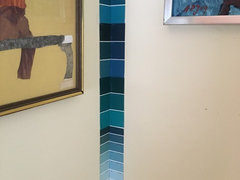
1. own your own fan deck. you can look at all the colors in your own home with your own stuff in your own lighting.
2. if you are vague on undertones, a. look at the darkest color on the strip, thats where the undertones show up the most. thats the color that it will look like behind the door. b. read the names of the colors. sounds dumb but you might not notice that a blue is sort of green but if the color name is 'evergreen' its going to veer towards green.3. pick the color on the strip you want as far as dark/light goes, and then go one box lighter. when its the whole room and not just a bitty square (or a 1 foot square sample) it will appear darker.
4. if you dont want to do any of those things bring home doubles on strips and put them either side of a corner.
oh and voila. i couldnt have been happier with my choice.
- PRO
Lori A. Sawaya
5 år sedanÄndrades senast: 5 år sedanSo it's been mentioned a couple times that you should look at the darkest color on the strip in order to identity the "undertones" of all the other colors.
And you absolutely should not do that.
The theory of undertones as most people apply it to architectural paint is riddled with issues. The biggest being "undertones" are individual, subjective perception.
You can't define, describe and order color based on individual, subjective perception - it especially does not work with paint colors.
"Undertones" are not a color attribute. It's just somebody's best guess about what they think a color looks like.
The color strips are not arranged with the darkest color (hue parent) at the bottom and then lighter gradations (child colors) above it.
There is no guarantee that all the colors on one strip belong to the same hue family let alone that the colors are regimented steps darkest up to lightest.
That's probably the #1 color myth perpetuated on the interwebs.
It's not just DIYers who fall for it, plenty of designers believe it's true too.
The thing is we can easily prove it's not true by simply looking at the color data/color notations for each color on a strip.
What we can see from the color data is sometimes all the colors on one strip are from the same hue family sometimes they're not.
And as far as value, sometimes the steps in value (light to dark) are reasonably even and equidistant on one strip and sometimes it's all mixed up.
Bottom line, there's really no detailed, formal order the colors on strips or the fandeck as a whole.
Laurie Schrader
5 år sedanAnd the other bottom line- just from experience. Laying strips on a wall is a poor indicator of how that color may look on that wall. Big boards, that you can carry around- see how it mixes with different light. Then?
Once you get your color, test paint very big squares on your walls. That will give you the best idea of how that will work against you existing paint.
cmjmck
5 år sedanÄndrades senast: 5 år sedan@Lori A. Sawaya how do you know what hue a color is? Or where it falls on your wheel? I m intrigued but just want to understand how that wheel is used. Thanks
- PRO
Lori A. Sawaya
5 år sedanÄndrades senast: 5 år sedan@minimom
It's easy. Paint colors come from values called CIE L*a*b*.
This is why I tell people not to waste time on paint color formulas; the colorants or cutting the formula by %.
The question to ask is where do you think the formula COMES FROM?
Those formulas come from mathematical models that use said CIE L*a*b* values.
That's why I say that the color data values and notations I talk about all the time -- and are on my color wheel -- are like color DNA.
Formulas are just a recipe and they're useless to try to decode because, just like cooking, there's more than one way to mix up a color (or a dish).
CIE L*a*b* values is what brands use to copy other brand's colors and mix them using their home ingredients (colorants and bases).
Deep dive into the color wheel and how to create harmonies here: https://campchroma.com/color-strategist-color-wheel/
Brief video overview about how to use the hue angles on the wheel here: https://www.youtube.com/watch?v=n08N9Q2tv4A&t=40s
That should be enough to get you started.
Reload the page to not see this specific ad anymore
User