620 foton på litet hus, med tak i mixade material
Sortera efter:
Budget
Sortera efter:Populärt i dag
61 - 80 av 620 foton
Artikel 1 av 3
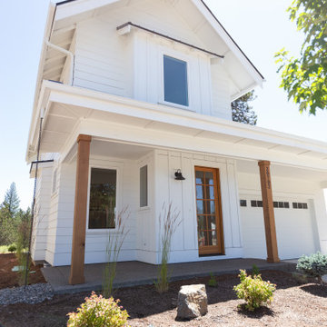
Foto på ett litet lantligt vitt hus, med två våningar, blandad fasad och tak i mixade material
A little cottage nestled into a picturesque Vermont village.
Photo: Greg Premru
Klassisk inredning av ett litet vitt hus, med två våningar, sadeltak och tak i mixade material
Klassisk inredning av ett litet vitt hus, med två våningar, sadeltak och tak i mixade material
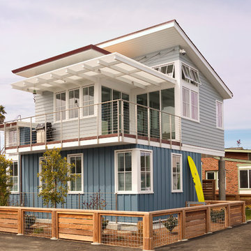
Inspiration för små amerikanska grå hus, med allt i ett plan, blandad fasad, sadeltak och tak i mixade material
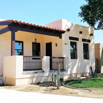
Amerikansk inredning av ett litet beige hus, med allt i ett plan, platt tak och tak i mixade material
Project Overview:
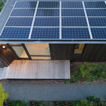
This modern ADU build was designed by Wittman Estes Architecture + Landscape and pre-fab tech builder NODE. Our Gendai siding with an Amber oil finish clads the exterior. Featured in Dwell, Designmilk and other online architectural publications, this tiny project packs a punch with affordable design and a focus on sustainability.
This modern ADU build was designed by Wittman Estes Architecture + Landscape and pre-fab tech builder NODE. Our shou sugi ban Gendai siding with a clear alkyd finish clads the exterior. Featured in Dwell, Designmilk and other online architectural publications, this tiny project packs a punch with affordable design and a focus on sustainability.
“A Seattle homeowner hired Wittman Estes to design an affordable, eco-friendly unit to live in her backyard as a way to generate rental income. The modern structure is outfitted with a solar roof that provides all of the energy needed to power the unit and the main house. To make it happen, the firm partnered with NODE, known for their design-focused, carbon negative, non-toxic homes, resulting in Seattle’s first DADU (Detached Accessory Dwelling Unit) with the International Living Future Institute’s (IFLI) zero energy certification.”
Product: Gendai 1×6 select grade shiplap
Prefinish: Amber
Application: Residential – Exterior
SF: 350SF
Designer: Wittman Estes, NODE
Builder: NODE, Don Bunnell
Date: November 2018
Location: Seattle, WA
Photos courtesy of: Andrew Pogue
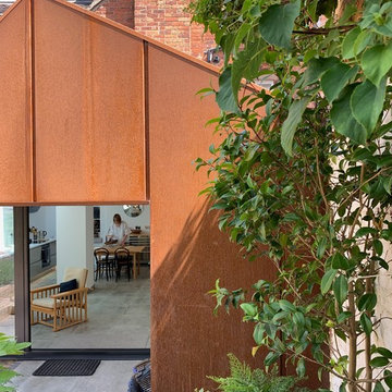
Our ’Corten Extension’ project; new open plan kitchen-diner as part of a side-return and rear single storey extension and remodel to a Victorian terrace. The Corten blends in beautifully with the existing brick whilst the plan form kicks out towards the garden to create a small sheltered seating area.
Idéer för ett litet maritimt beige hus, med allt i ett plan, blandad fasad, sadeltak och tak i mixade material
Photography by Richard Chivers https://www.rchivers.co.uk/
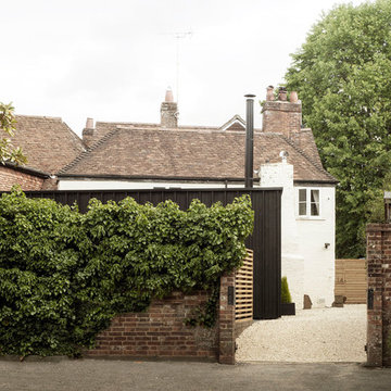
Marshall House is an extension to a Grade II listed dwelling in the village of Twyford, near Winchester, Hampshire. The original house dates from the 17th Century, although it had been remodelled and extended during the late 18th Century.
The clients contacted us to explore the potential to extend their home in order to suit their growing family and active lifestyle. Due to the constraints of living in a listed building, they were unsure as to what development possibilities were available. The brief was to replace an existing lean-to and 20th century conservatory with a new extension in a modern, contemporary approach. The design was developed in close consultation with the local authority as well as their historic environment department, in order to respect the existing property and work to achieve a positive planning outcome.
Like many older buildings, the dwelling had been adjusted here and there, and updated at numerous points over time. The interior of the existing property has a charm and a character - in part down to the age of the property, various bits of work over time and the wear and tear of the collective history of its past occupants. These spaces are dark, dimly lit and cosy. They have low ceilings, small windows, little cubby holes and odd corners. Walls are not parallel or perpendicular, there are steps up and down and places where you must watch not to bang your head.
The extension is accessed via a small link portion that provides a clear distinction between the old and new structures. The initial concept is centred on the idea of contrasts. The link aims to have the effect of walking through a portal into a seemingly different dwelling, that is modern, bright, light and airy with clean lines and white walls. However, complementary aspects are also incorporated, such as the strategic placement of windows and roof lights in order to cast light over walls and corners to create little nooks and private views. The overall form of the extension is informed by the awkward shape and uses of the site, resulting in the walls not being parallel in plan and splaying out at different irregular angles.
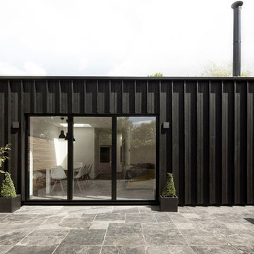
Externally, timber larch cladding is used as the primary material. This is painted black with a heavy duty barn paint, that is both long lasting and cost effective. The black finish of the extension contrasts with the white painted brickwork at the rear and side of the original house. The external colour palette of both structures is in opposition to the reality of the interior spaces. Although timber cladding is a fairly standard, commonplace material, visual depth and distinction has been created through the articulation of the boards. The inclusion of timber fins changes the way shadows are cast across the external surface during the day. Whilst at night, these are illuminated by external lighting.
A secondary entrance to the house is provided through a concealed door that is finished to match the profile of the cladding. This opens to a boot/utility room, from which a new shower room can be accessed, before proceeding to the new open plan living space and dining area.
The project features a pair of modern residential duplexes with a landscaped courtyard in between. Each building contains a ground floor studio/workspace and a two-bedroom dwelling unit above, totaling four dwelling units in about 3,000 square feet of living space. The Prospect provides superior quality in rental housing via thoughtfully planned layouts, elegant interiors crafted from simple materials, and living-level access to outdoor amenity space.
Front facade
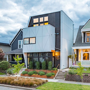
Inspiration för små moderna vita hus, med två våningar, blandad fasad, platt tak och tak i mixade material
Inspiration för små moderna vita hus, med två våningar, blandad fasad, platt tak och tak i mixade material
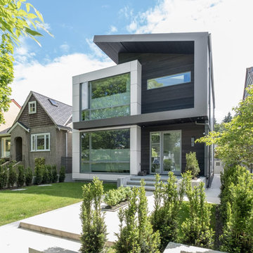
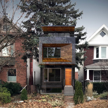
Idéer för att renovera ett litet minimalistiskt flerfärgat hus, med tre eller fler plan, sadeltak och tak i mixade material
Fotografías AD+ arquitectura
Idéer för små funkis grå hus, med allt i ett plan, blandad fasad, platt tak och tak i mixade material
Idéer för små funkis grå hus, med allt i ett plan, blandad fasad, platt tak och tak i mixade material
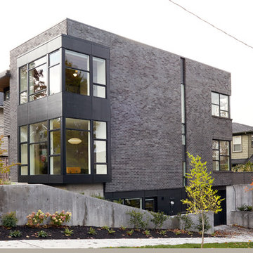
Primary exterior materials are charcoal color brick, fiber cement siding, and aluminum clad windows.
Inredning av ett modernt litet svart hus, med tre eller fler plan, tegel, platt tak och tak i mixade material
Inredning av ett modernt litet svart hus, med tre eller fler plan, tegel, platt tak och tak i mixade material
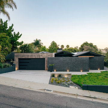
textured brick walls provide architectural interest at this mid-century home facade, as well as allow privacy for the pool and various gathering spaces at the large entry courtyard
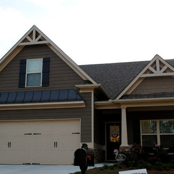
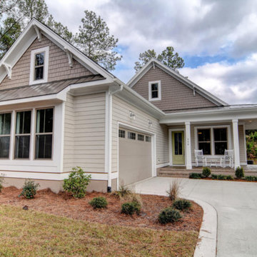
Modern Farmhouse
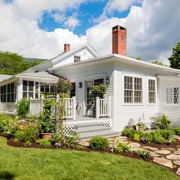
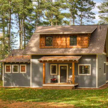
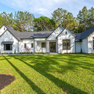
Exempel på ett litet lantligt vitt hus, med allt i ett plan, blandad fasad, sadeltak och tak i mixade material
Exempel på ett litet lantligt vitt hus, med allt i ett plan, blandad fasad, sadeltak och tak i mixade material
Photography by Richard Chivers https://www.rchivers.co.uk/
Marshall House is an extension to a Grade II listed dwelling in the village of Twyford, near Winchester, Hampshire. The original house dates from the 17th Century, although it had been remodelled and extended during the late 18th Century.
The clients contacted us to explore the potential to extend their home in order to suit their growing family and active lifestyle. Due to the constraints of living in a listed building, they were unsure as to what development possibilities were available. The brief was to replace an existing lean-to and 20th century conservatory with a new extension in a modern, contemporary approach. The design was developed in close consultation with the local authority as well as their historic environment department, in order to respect the existing property and work to achieve a positive planning outcome.
Like many older buildings, the dwelling had been adjusted here and there, and updated at numerous points over time. The interior of the existing property has a charm and a character - in part down to the age of the property, various bits of work over time and the wear and tear of the collective history of its past occupants. These spaces are dark, dimly lit and cosy. They have low ceilings, small windows, little cubby holes and odd corners. Walls are not parallel or perpendicular, there are steps up and down and places where you must watch not to bang your head.
The extension is accessed via a small link portion that provides a clear distinction between the old and new structures. The initial concept is centred on the idea of contrasts. The link aims to have the effect of walking through a portal into a seemingly different dwelling, that is modern, bright, light and airy with clean lines and white walls. However, complementary aspects are also incorporated, such as the strategic placement of windows and roof lights in order to cast light over walls and corners to create little nooks and private views. The overall form of the extension is informed by the awkward shape and uses of the site, resulting in the walls not being parallel in plan and splaying out at different irregular angles.
Externally, timber larch cladding is used as the primary material. This is painted black with a heavy duty barn paint, that is both long lasting and cost effective. The black finish of the extension contrasts with the white painted brickwork at the rear and side of the original house. The external colour palette of both structures is in opposition to the reality of the interior spaces. Although timber cladding is a fairly standard, commonplace material, visual depth and distinction has been created through the articulation of the boards. The inclusion of timber fins changes the way shadows are cast across the external surface during the day. Whilst at night, these are illuminated by external lighting.
A secondary entrance to the house is provided through a concealed door that is finished to match the profile of the cladding. This opens to a boot/utility room, from which a new shower room can be accessed, before proceeding to the new open plan living space and dining area.
Gina Viscusi Elson - Interior Designer
Kathryn Strickland - Landscape Architect
Meschi Construction - General Contractor
Michael Hospelt - Photographer
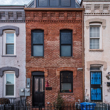
The front of the row house with the bump up.
A complete restoration and addition bump up to this row house in Washington, DC. has left it simply gorgeous. When we started there were studs and sub floors. This is a project that we're delighted with the turnout.
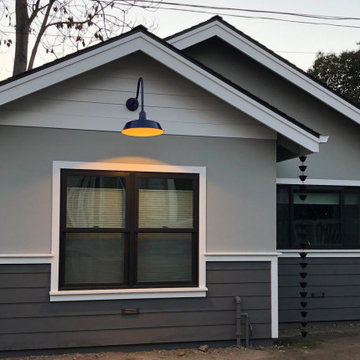
The ADU is finished in grey stucco and grey and white clapboard with black windows and rain chains. The window on the left is the bedroom, and the one on the right is the kitchen. The front door is to the left of the house.
Modern Addition
Idéer för små funkis svarta hus, med tre eller fler plan, platt tak och tak i mixade material
Idéer för små funkis svarta hus, med tre eller fler plan, platt tak och tak i mixade material
620 foton på litet hus, med tak i mixade material
4