melaniecp

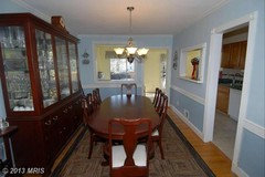
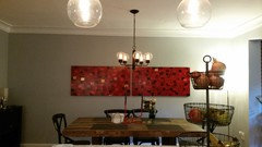
How to hang artwork???

melaniecp
9 år sedan
We have two matching pieces of art but would appreciate advice on how to hang them on our very large wall. (See 4 attached pictures.) Thanks so much!!!

Kommentarer (269)

  • mproven
    9 år sedan
    3 and 4 ---- but don't add too much space between the 2 if you do 3 --- no more than 2 to 2 and 1/2 inches at best --- --- need big plant/palm in corner near the (bar)?
    Also, lower your chandlier a few inches,,, your room looks like a high ceiling. If you can afford it, I would change out the light fixture --- your table is swallowing it up -- go for something with lots of pow -----
    melaniecp thanked mproven
  • Peg
    9 år sedan
    #1 - had this exact dilemma, chose #1 & loved it. Moved, no space for the horizontal and never liked another configuration. Mine were inexpensive Ikea prints so I gave them away rather than do anything other than #1.
    melaniecp thanked Peg
  • PRO
    What's Inside Design Ltd.
    9 år sedan
    Ändrades senast: 9 år sedan
    Have you considered how you want the space to feel?
    Vertical Lines - lend dignity and formality to a space
    Horizontal Lines - create a restful and informal feel
    Because you have four great options, I would consider "feel" first! :)
    Have fun!
    melaniecp thanked What's Inside Design Ltd.
  • jejacque
    9 år sedan
    I'm basing this on the style of the painting: I think #1 is a bold, sleek statement, and it's a nice modern balance against your dining set. Hanging both canvasses as one piece of art gives it more weight so it's in better proportion to the wall and creates one solid focal point. Separating them looks choppy/repetitive to me, and might be more suited to a more traditional set of paintings. (#4 also looks great but not on this long wall).
    melaniecp thanked jejacque
  • Parimita Hura
    9 år sedan
    Gosh ! Melaniepie!! How long will this thread go ?? Hang in - Hang there - we all are hanging around to see the final result.
    melaniecp thanked Parimita Hura
  • Parimita Hura
    9 år sedan
    Oh - BTW Melaniepaci - Can the mirror on the side chest be a bit bigger !
    melaniecp thanked Parimita Hura
  • 0741
    9 år sedan
    I like #3 for the art work but as I keep looking at your space the art work seems lost...there is no other red in the space you're showing us. I think the picture would have a greater impact if you added red place mats or napkins or seat cushions. Maybe a flower arrangement on your server etc. Repeating the colour through out your space (in 3's or 5's) will make the picture become an important part of your dinning room. Good luck!
    melaniecp thanked 0741
  • Vintage...VJ Jazzy Jazz
    9 år sedan
    Ändrades senast: 9 år sedan
    Your dilemma ....could........ go on and on ....
    How about ......
    One month ...you have the picture
    One way ....and so on
    Live with each way ....for a while
    See which way you like the best ....
    That's a lot of ways lol
    Oh ......and nail holes ..
    Good luck with whatever you decide ...
    Oh and take a picture....lol
  • mproven
    9 år sedan
    to respond to 0741 --- I agree with your statement. Red should be repeated somewhere else - it would be nice too, to see the whole room. I stand with adding a large palm or ficus tree.
    melaniecp thanked mproven
  • melaniecp
    Författare
    9 år sedan
    Yes, we are trying to repeat red throughout the room. As you see in these pics of the rest of the room we have red in art above the sink, red in our dishtowels, a red candlestick holder on our table, and red apples in the fruit basket : ) We recently purchased the place mats and they weren't cheap so don't want to swap those out just yet. Any other suggestions for bringing more red in or is what we have good enough?
  • mproven
    9 år sedan
    WOW!!! It's BEAUTIFUL --- I get a different perspective now... The island is great! Where did you get that?
    melaniecp thanked mproven
  • mproven
    9 år sedan
    Did you do your own decorating? What a great room!!!
    melaniecp thanked mproven
  • melaniecp
    Författare
    9 år sedan
    Thanks mproven for the very kind words. I did design the kitchen myself, with my husband's input. And of course countless hours on Houzz for ideas and inspiration. (Let me know if you want to see the before pics!) It was recommended to us that we do a built-in island but we felt that the space would be airier and more approachable if we went with this approach. Plus we can take our island if we ever leave. It's the French Island from Crate and Barrel with a marble top. We love it.
  • mproven
    9 år sedan
    The open island is perfect. My husband and I live in Michigan, however we plan to move to Sun City West Arizona in a few years, and thus will have a more open floor plan to (have fun with). We (will) go from a formal living room, din room and family room home, to a great room with (we anticipate) open floor plan - and a more casual life-style. Several rooms of furniture we currently have will not be making the move with us... I think open coffee tables or glass top will be on our list for (new) furniture too. What a difference they make!
  • zazfuzzroc
    9 år sedan
    You're rooms are awesome, love the island, cool! I think you're just fine on your own. I'd love to hang out in that space. The shelves over the sink are neat too. Good luck! :)
    melaniecp thanked zazfuzzroc
  • Libbmom
    9 år sedan
    Some cloth napkins in red would be nice with some pretty napkin rings...really pretty space.
    melaniecp thanked Libbmom
  • lovemykids
    9 år sedan
    Your artwork is too big to go vertical. If your ceilings were higher it would work better. In pictures 3 and 4 everything is centered in the same place - the table, chandelier, and artwork. You would have to add more things to the left and right of the pictures such as an indoor tree. Then the room begins to be over loaded. You want your artwork to be noticed. In pictures 1 and 2 it draws my eyes outward. I see the length of the room and I get to appreciate the artwork as it is not stuck behind the chairs, chandelier, and table. I would go with picture 2.
  • Darzy
    9 år sedan
    Yes, your kitchen design is fab! I'd love to see the "before" photos.
    melaniecp thanked Darzy
  • bstiewe
    9 år sedan
    As an art consultant, I want to first say that you've acquired a very flexible piece that will change character when you move it around your home. Number 4, gives the piece the strongest feeling of "importance", but I agree that it's a bit narrow for the area. (Not to worry, you may find another larger piece and want to move this one at some point.) I'd suggest centering opposite the chandelier at 58" at the center.
    melaniecp thanked bstiewe
  • melaniecp
    Författare
    9 år sedan
    Hi Darzy. Thanks for the kind words. Here are some pics of the "before. "
  • zazfuzzroc
    9 år sedan
    WOW! I'm impressed. That's great!
    melaniecp thanked zazfuzzroc
  • printesa
    9 år sedan
    That is an amazing transformation!
    melaniecp thanked printesa
  • Jacquie
    9 år sedan
    Beautiful transformation!
  • PRO
    moca23
    9 år sedan
    Congratulations! This transformation is just phenomenal! Great vision!
    If you can't decide about the artwork, consider an art-rail like they have in museums. It can be installed directly below the ceiling and is available in various colors like white or silver metal. I am just in the process of purchasing one for my house so that I can interchange the large-scale art I create myself without ruining the walls.
  • Darzy
    9 år sedan
    Melanie...oh yes! Drab to fab! Great vision. And, no more claustrophobia!
  • ys15
    9 år sedan
    To match the amplitude of the dining table the best is hang the paintaings horizontally separated. If you have any doubt feel free to contact. Ypa Sevillano from YS Ambiances http://www.ysinteriorsandgarden.com/
  • Angela Reece
    9 år sedan
    Well?? What did you decide??
    melaniecp thanked Angela Reece
  • melaniecp
    Författare
    9 år sedan
    We haven't hung them yet because we've been so busy preparing for our basement renovation to start tomorrow! I hope we get to it this week and I've narrowed down my choice to horizontal, either together or just 1/2 - 1 inch apart. I will be sure to post pics once we hang them!
  • Vintage...VJ Jazzy Jazz
    9 år sedan
    Ändrades senast: 9 år sedan
    @maryfran9 ....just wondering ..
    How do /can you like your own comment on here ?
    As it appears you have done
    Please tell
    So I can like all of MINE ..lol
  • zazfuzzroc
    9 år sedan
    @melaniepaci, sometimes people don't realize that you have a life. lol :) Your place is great. I can't wait to see either. Good luck on your new project, I'm sure it will turn out cool too! :)
  • jacgorgeous
    9 år sedan
    Yeah what did you decide?? please post!
  • PRO
    Alexandria
    9 år sedan
    Looks nice
  • melaniecp
    Författare
    9 år sedan
    We finally made a decision and hung our artwork! I tallied the votes and horizontal together and apart were neck to neck, so we compromised and hung them with just one inch between them. On to the next project and new dilemma!
  • melaniecp
    Författare
    9 år sedan
    Thanks to everyone who helped us!!!
  • PRO
    Sandy G. ltd.
    9 år sedan
    It' s perfect! Absolutely perfect! Be careful to edit things you set on the table so I doesn't get cluttered. You are at the limit now. Choose something simple, like one, low, big pottery bowl and fill it with fruit.
  • PRO
    Appleton Art Design, LLC
    9 år sedan
    looks perfect:)
  • spisland
    9 år sedan
    It's perfect, Melaniepaci, acknowledging their separation, yet the same effect as one large piece of art. Really nice!
  • zazfuzzroc
    9 år sedan
    They're grrreeeaat! :) lol
  • squeenn
    9 år sedan
    Looks great and it frames the table and the chandelier does not block the paintings. Good choice!
  • The big house
    9 år sedan
    Perfect. Good choice.
  • debbiea56
    9 år sedan
    #2 But I'm sure you've decided by now LOL
  • PRO
    ep visualz - Architectural Rendering - 3D Models
    9 år sedan
    I think option #2 or #4 (two separate) work best for your space.
  • ftmom
    9 år sedan
    Since your table is long, the art piece will look best centered above the table and under the chandelier. So pic. #1 but lower and center with the table.
  • chuppi
    9 år sedan
    Good call! Well balanced & you did justice to the fact that they are indeed
    two separate pieces of art! Congrats...
  • zazfuzzroc
    9 år sedan
    Hi Melanie, Just wanted to check in.... was wondering how the basement is coming along? You did so well with upstairs, I just had to ask. :) If you're not sharing, that's okay. lol :) Have a great holiday and new year! :)
  • melaniecp
    Författare
    9 år sedan
    Thanks for asking! We hope to be completed with the basement in a few weeks. I'd love to share pics when it's done. Should I post them to this thread or is there a way to send them to you directly?
  • zazfuzzroc
    9 år sedan
    Hi Melanie, I'm sure that I'm not the only one that wants to see. You guys did really great on your space. So I can only imagine the basement. :) If you have before pictures, I would post a before and after. :) Maybe leave the link here..... or just post them here. I'm sure it will get lots of attention. lol :)
  • chetthomas
    9 år sedan

    Wow Lots of comments. Way to go on the post! It really has drawn attention. This is my suggestion #1 due to the laws of odd numbers as mentioned above. The height would depend on how you use the space if you are mainly sitting down then I like the idea of the art being lower. As you already know from the gallery experience to get visually lost in an artwork your eyes should hit 3/4 the way up the piece. The addition of a third piece could be another illustration by the artist or an artistic representation of the artists name.

  • jacgorgeous
    9 år sedan

    Love it!!

  • Schretzezgirl
    9 år sedan
    Ändrades senast: 9 år sedan

    Beautiful space! Would love to see what you ultimately went with? I absolutely love the wall color. What color is it? Thank you!

Sponsored

Reload the page to not see this specific ad anymore

Sverige
Skräddarsy min upplevelse genom att använda cookies

Houzz använder cookies och liknande teknik för att anpassa min upplevelse med relevant innehåll och det bästa Houzz produkter och tjänster kan erbjuda mig. Genom att klicka 'Acceptera' accepterar jag detta, så som det vidare beskrivs i Houzz Cookie Policy. Jag kan avvisa icke-essentiella cookies genom att klicka 'Administrera preferenser'.