Paint color
sab1948
9 år sedan
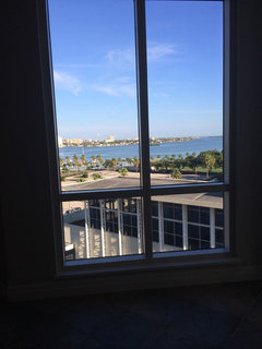
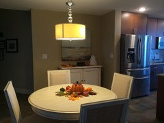
Bowling ally style kitchen, dining and living room. Quite dark. Went with beige last year and I hate it. Thought it would be light enough but it's depressing every time I walk into house. Any suggestions to make my condo bright. No hospital white tho. Plus very dark tile that must stay. It's throughout entire condo so it would be too costly.

Utvalt svar
Sortera efter:Äldsta
Kommentarer (35)

sab1948
Författare9 år sedanTrying to go beachy. Just ordered nice teal island lights and working on bluish green backsplash. Don't think yellow would work.everdebz
9 år sedancolor of furnishings? beachy because you live near one? so is your condo lacking sunlight??sab1948
Författare9 år sedanYes, I live on the inter coastal. Only natural light comes through living room window and sliders that are right next to LR window. Distressed white dining table. Distressed white entertainment unit. Working on getting a new sofa ( probably off white leather. )- PRO
User
9 år sedanIMO it's not the color alone that makes you depressed but the whole decoration of your condo together
i can't see what to you have from those pictures, if you want my professional opinion post more photos from different angles lagwagonshow
9 år sedanThos. Baker hit the nail on the head. Light grey, find one that gives you the lift you need when you walk in the door. PRO
PROThos. Baker
9 år sedanÄndrades senast: 9 år sedanThanks lagwagonshow -- I locked myself out of the house today. Had to call a locksmith and pay a tidy fee -- so your support has lifted my spirits!
Christi, on behalf of Thos. Bakereverdebz
9 år sedan"Choose the shade of gray for your room. Warm grays tend to lean more toward brown, while cool grays can look almost blue. Warm grays are wonderful for natural or traditionally styled rooms. Cool grays work well with contemporary and modern design."
A more feminine room can pair oranges or reds with a warm gray. Read more : http://www.ehow.com/how_5565335_design-rooms-gray-paint.htmleverdebz
9 år sedanPosting because of your distressed white:
"Decorating a gray living room with white accents provides the space with a fresh, bright look. Create a crisp, clean sense of style in your room with bright white trim and door colors. Add a white area rug, curtains or furniture to complete the look. While gray can appear dulling to the senses, a true white will balance the color and change the entire feel of the room. Take your white decor a step further and include a variety of extra touches such as white flowers near a gray wall or antique white picture frames." Read more : http://www.ehow.com/info_12084060_decorating-colors-well-gray-walls-living-room.htmleverdebz
9 år sedana bit elegant to go with darker tiles? a couple beachy colors? http://www.jcpenney.com/window/studio/studio-dylan-ombre-grommet-top-curtain-panel/prod.jump?ppId=pp5003590771&&rrplacementtype=search_page.content2sab1948
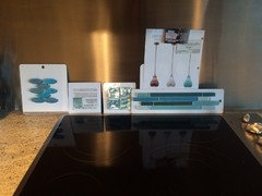
Författare9 år sedanThe unit was actually three shades of grey when we bought it. One of which was quite light. I've posted these before but I'll do it again. I think I'm on the right track with my plans. It's just the paint color. I was certain the sand colored beige was the right choice but I was sooo wrong. I'll try to put my new island lights on. I'm not sure how.


fitnessbuff
9 år sedanI agree with the light gray, accents of white, and your teal colors (I like the reference to a washed-out, per your tile flooring).
Two other colors to consider: BM Edgecomb Gray, which at first glance is very light, however, it would work great with the walls that don't receive much light. The walls that do receive natural light, BM Revere Pewter is a great choice. These two colors are next to each other in the fan deck, and work so nicely near adjoining rooms. My new house is giving me natural lighting issues, and after several months (yes!) we've come to this very settling conclusion. I would choose an area rug with some teal for balance.sab1948
Författare9 år sedanOh gosh. I just sent a huge comment with pics and it didn't post. Trying again. I think I have a handle on my decor, a little at a time. It's really the paint. I thought the sandy beach colored beige would do the trick but it didn't.


 PRO
PROSusan Melrath
9 år sedanI wonder if gray is going to have the same results as beige? I would go for more color since you have neutral and white furniture. How about a warm, soft bronze? http://www.benjaminmoore.com/en-us/for-your-home/our-five-favorite-orangesUser
9 år sedanI know when I am in a mood to lift my spirits, I do not run to the closet and pick out a gray outfit;( ...sab1948
Författare9 år sedanOne more question and then I'll leave you helpful people alone. I used eggshell before. My neighbor has the same exact unit with same exact lighting. She used porter paints horseradish but in satin sheen. Much more shine then mine so it looks so bright. But I think the kicker is, she has nice off white tile compared to my very dark tile. What type of sheen should I use when I decide on a color.User
9 år sedanÄndrades senast: 9 år sedanI like low sheen on my walls which would be the eggshell but it is all preference;)
Natalie
9 år sedanSatin has more sheen than eggshell. If you like the look of your neighbor's walls, use it instead. Good Luck!everdebz
9 år sedanÄndrades senast: 9 år sedanI fear that grey Might be a drag just like the beige but hey maybe you Love grey, just say?
oh with a teal paint you could highlight same color in higher sheen: [or for warmth, a muted coral]
stripes, a pattern of some kind, you think? ... I know, the tiles already have a pattern ...rug?- PRO
Thos. Baker
9 år sedanÄndrades senast: 9 år sedanLooks like you simply chose too dark of a shade for your walls if you were after a "sandy or beachy" color scheme. If you want to stick with a "sand" color, it will work, but you'll have to go much lighter, such as the color Natalie posted above called Balboa Mist. It's a beautiful color. I'm posting a similar color, which may be a little bit lighter: Benjamin Moore Abalone. Even the name says sea shells! Both are from the gray/beige family and either would complement your flooring and work well with turquoise. As for sheen, I'd go with eggshell.
Christi, on behalf of Thos. Baker
 PRO
PROMonica Nordquist Design
9 år sedanWith the blue-green (teal), a red-orange (a very light tint of it, as a cream with those undertones) will complete what the eye wants since those colors sit opposite each other on the color wheel. I have that combo in my living room and get great comments on how great and unique it is. I use copper accents in small amounts an it just sings!


Sponsored
Reload the page to not see this specific ad anymore
Fler diskussioner


Thos. Baker