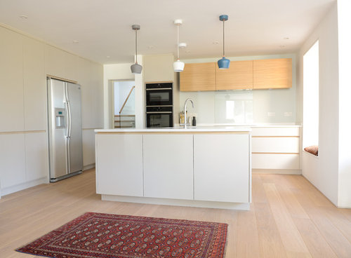
What's missing in this kitchen?
The starkness of this kitchen works well as it creates impact and draws the attention to the pendent lighting and hints of colour laced through the room. But what would you change / add? https://www.houzz.co.uk/projects/2484916/modern-kitchen-with-pendant-lighting
Kommentarer (21)

Ellie
6 år sedanÄndrades senast: 6 år sedanLooks not lived in. Needs some personal touches - photos/wall art.
Needs some colour.
Needs a dining table, assuming there is space.
Needs a kettle and a big mug.
I would remove the rug.
Bath Bespoke thanked Ellie
Daisy England
6 år sedanI know people have 2 tone kitchens but I don't like the wall unit doors. It's not a contrast but just looks out of place plus there's a space at the end what needs a filler piece.
The rug doesn't go at all. It's a modern kitchen with a traditional old fashioned rug. A rug with bright colours would look much better.
It's absolutely lacking in colour. Pale and bland. To be honest I'm not sure I'd be delighted with it if it were mine.bryan4974
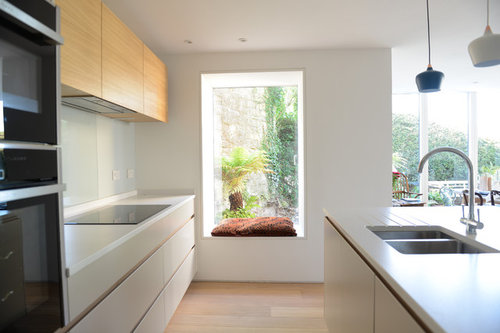
6 år sedanThe wall cupboards are too high above the counter below to be visually attractive and the pendant lights are too small for the size room. there is no "stand out" feature in the room except a mismatched rug. Some bright cushions - instead of fairly flat single one - in the window reveal would be a start.
minnie101
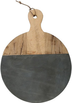
6 år sedanI think it looks good and the rug appears to tie in with the dining table. Not these exact things together (!) but something along these lines so perhaps a large wooden board propped up on the right hand side (I like this one to pick up on the oven colour) with a pile of ceramic bowls in front. Some colour for a vase for the island with some stems plus a serving bowl with some fruit or veg


 PRO
PROCaldicot Kitchen & Bathroom Centre
6 år sedanReally like the overall simplicity of the design and the "pared back" approach - the balance & symmetry of the units and cleanliness of the lines is spot on. That said, it is at risk of tipping over the "bland" line. For me, it needs some dramatic injection of form & colour with bold, architectural vases/bowls/ktchen appliances and some vibrant art - simply mounted in a matching wood frame with large white mount board.
Also not sure about the rug - I find it a bit jarring with the rest of the aesthetic. Love the basic skeleton, though.
Bath Bespoke thanked Caldicot Kitchen & Bathroom CentreJonathan
6 år sedanThere are some things that I like such as the soft white chosen and the extra wide drawers but I think there are a number of odd choices- such as the ugly fridge, the birch that is slightly different from the floor, the deep island that has no purpose, the weirdly high wall units, the undersized gap at the end of the wall cabinets, the undersized pendant lights, the traditional rug.
Ultimately you have to deliver what the client wants.Bath Bespoke thanked Jonathan
A S
6 år sedanI don't particularly think this space looks particularly wrong or bad, it's just lacking personality with a few 'hmmm' things.
I'd definitely go for slightly larger pendants so that it co-ordinate with the rest of the room and maybe be more bold in the colour of pendants.
The colour of the wall units and flooring is slightly annoying due to tonal variation; either opt for the same shade or a contrasting colour.
I don't think the rug ties in with the scheme at all...it's too busy for the minimalistic modern kitchen...I think the rug should pick up on one of the pendant colours and have a more contemporary pattern...alternatively it should be bright to help bring some 'life' to the space...
Lastly it just needs living, a vase, a few frames, some storage jars would just elevate the look off the space....minnie101
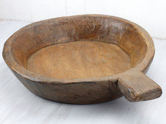
6 år sedanHi Claire. Sorry I've just seen it was from an Australian website:( I've had a quick look and can't find a slate one but will let you know if I ever come across one. There are lots of wood and marble ones around. I also like the black oak as a group by rockett st George


chloeloves
6 år sedanWhy not paint the walls - too much bland white and cream, and if they were daring could paint the window reveal in a bright shade to give a pop of colour
Juliet Docherty
6 år sedanI don't think colour is the issue, it's tone that is lacking. Convert the image to black and white and it will look a bit insipid. The bank of cupboards where the fridge is would have benefited form being a dark colour, the pendants are nice but need to be much lower and the wall cupboards look a little high with gaps. I actually think the rug works well and would add more things with character. The splash back would have been more dramatic if perhaps teal tiles were used instead of glass.
 PRO
PROFour Seasons Interiors
6 år sedanThe neutral tone with timber handle-less channel gives a really nice clean look, very Scandinavian. I'm not sure about the gaps either side of the wall units though. Personally I'd like to see a filler either side to take them to the oven housing/wall.

Stephen Edwards
6 år sedanI have friends who would love it, but it's a bit too sleek for me. If it was mine it would have dogs' paw prints and nose marks on the cupboard fronts, several mugs on the side, a fruit bowl and a pile of letters, bills and newspapers threatening an avalanche.

headers13
6 år sedanNot my type of kitchen. Don't like the wooden units, don't like the fridge, rug looks bad, mismatched lights....... I don't like it.

Prince Fafa
6 år sedanits too sterile and hospital like..not homely..change splash back to a vibrant colour e.g turqouise. change rug to something contemporary...fill up dead space beside wall unit ...create bookshelves on island, a dresser will do magic in this kitchen...pottery ,probably terracota..pictures on the walls...I love the picture window n seat...flowers in a vase..window dressing?amberyouell
6 år sedanI have different coloured pendants in my kitchen but the colours are reflected in the rest of the room. Where is the grey and teal in this design?

Reload the page to not see this specific ad anymore
PWJ Architects Ltd