
Resene
Pastels as neutrals
For many more cautious colour users, these muted pastels are a great step up from neutral colours. They still have that easy-on-the-eye appeal and flexibility of neutrals like grey and greige but they give a room more personality. In fact, many of the colours in the Resene Whites & Neutrals collection could also be termed ‘pastel’. It’s a fine line.
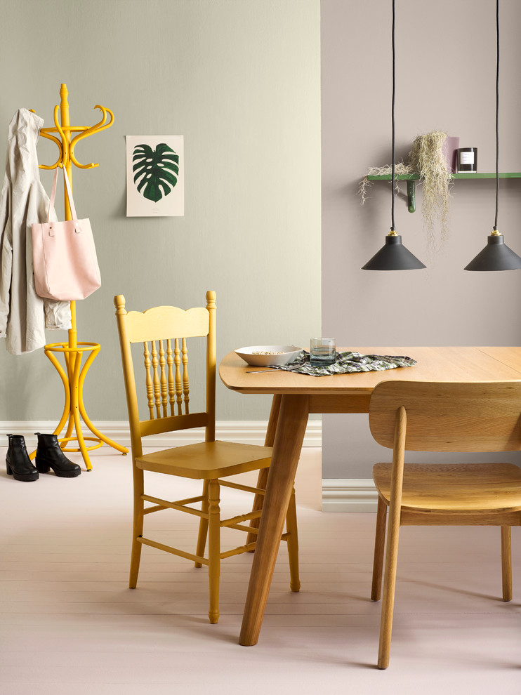
A scheme that uses some anchor colours from the neutrals chart then adds some more colourful pastels can be hugely successful – just like this dining. They are very easy to use and it’s easy to use a number of these types of colours together.
The back wall is in Resene Tana and the front wall is Resene Half Perfect Taupe. Add two pink pastels in Resene Soulmate for the floor and Resene High Tea for the vase on the shelf. Gem then layered on a couple of earthy pastels, Resene Tussock for the chair and Resene Seaweed for the shelf.
A scheme often comes to life with well-chosen accents. In this example, the room is saved from becoming too gluggy and boringly tonal by adding a sharp mustard coat rack, painted in Resene Hot Toddy, and clean bright skirting boards in Resene Alabaster.
If you’re using different coloured pastels together, use those with the same saturation or tint levels. Either all dusky pastels together like this dining room, or all light and bright pastels together.
Styling by Gem Adams, photo by Melanie Jenkins.