Home
This compact four-bedroom villament spread across three floors has been designed for a family of five in the heart of Bengaluru to pair visual symmetry with easy-to-use functionality. The design concept focuses on creating a spacious and open environment, with an overarching palette of shades of white complemented with pops of colour and natural textures, paired with wood and brass accents as focal points.
A customised verdant-print wallpaper creates a warm welcome on the top half of the entrance wall, with the bottom paneling painted white. Paired with white accessories—such as the lights on the wall and the floating console table—this makes what would have otherwise been a tiny vestibule feel clutter-free with an element of freshness.
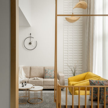
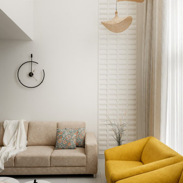
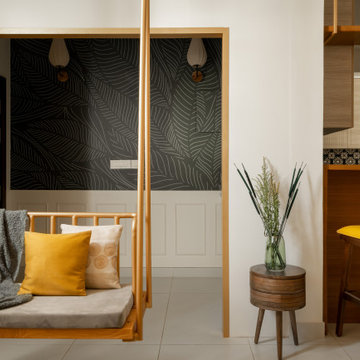
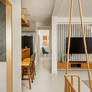
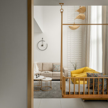
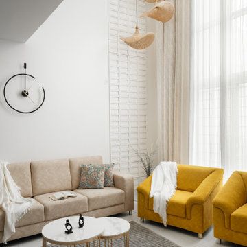
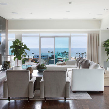
The entrance opens into the living room, which is swathed in shades of white, with hints of brass and wood for a touch of warmth and visual intrigue. A wooden swing, which faces the rest of the space, has been placed for the grandparents but can be removed to make the room feel more open when required. The furniture selection and seating options aim to provide a balance between contemporary and traditional aesthetics with a focus on creating a comfortable and inviting space for family gatherings and entertaining guests. Since this area has a double-height ceiling, a geometric-lined moulding running along the length of the entire wall, with hanging rattan lights in front of it, breaks any visual monotony here. A similar linear pattern continues across the TV console, which also allows natural light to stream between the staircase behind it.
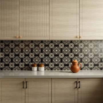
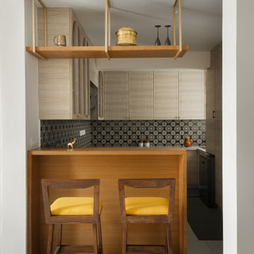
The otherwise monochrome kitchen, which opens into the living room, displays similar pops of yellow that form a harmoniously warm contrast against the black patterned backsplash tiles. The breakfast counter creates a visual barrier between the two rooms, allowing space for a quick or casual meal when needed. The flooring from the living room continues into this area, and the shared design elements between the two rooms quietly build a striking balance and connection between modern and traditional styles.
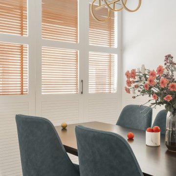
While the clients wanted French windows running across one side of the dining room, we couldn’t make any changes to the building façade. As a nifty solution, we covered the original windows with wooden blinds (to conceal them while still allowing sunlight to stream in) and built French doors along a thin corridor in front of it. Similar to the rest of the house, a console cabinet in a niche beside the dining table provides maximization of storage here for crockery and cutlery.
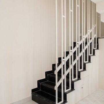
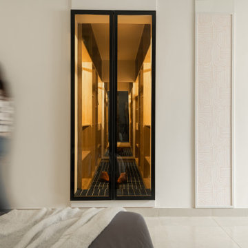
The staircase along the corridor between the living and dining room leads the way up to the first floor which houses the home office, master bedroom and the daughter’s room. A niche has been carved out below the stairs to hold utilities, and odds and ends around the house.
For the couple that loves to read, the home office doubles as a library with ample storage space for their collection of books above, as well as files and work belongings below the desk. A cosy reading bay has also been built along the window. The colour palette here remains neutral, allowing a peaceful and productive work environment.
Built as a simple and tranquil space, the master bedroom has predominantly been painted in white with a hint of royal blue to create subtle focal points on the bed’s headboard, the art, and the upholstery in the seating area across the bed. Originally a space for the balcony, this cosy seating space was enclosed to open up the bedroom. Textured wallpaper panels with geometric patterns interspersed between the adjacent wall add depth to the room. The walk-in closet—fitted in an area that was previously a passage—provides ample storage while maintaining a cohesive design aesthetic with the rest of the room.
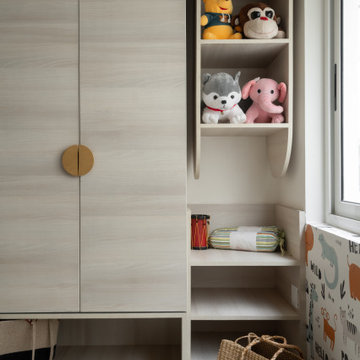
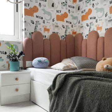
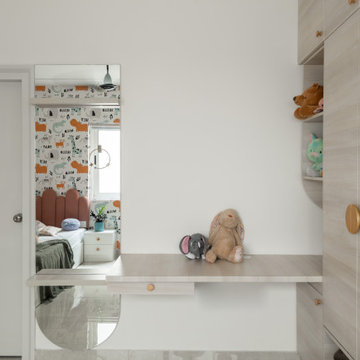
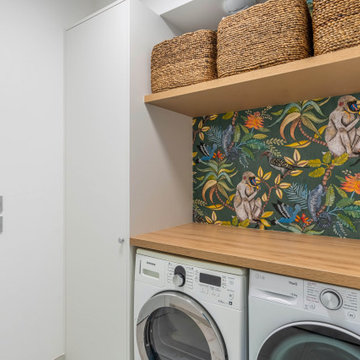
Next to it, the daughter’s room has been designed to hold multiple storage points—a necessity for any growing child who will need a slew of belongings, toys and school material over time. The furniture pieces and placement have been carefully chosen to allow her movement and play across the room through the day,
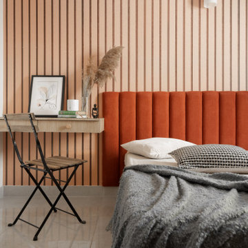
On the second floor, which opens into the terrace, the guest bedroom has been designed to echo the luxury and comfort of a hotel room, without feeling too loud or overwhelming. A burnt orange headboard lends a cosy warm charm to the space, while the parallel-line wallpaper behind it elongates the height of the wall in an otherwise low-ceilinged room.
This compact four-bedroom villament spread across three floors has been designed for a family of five in the heart of Bengaluru to pair visual symmetry with easy-to-use functionality. The design concept focuses on creating a spacious and open environment, with an overarching palette of shades of white complemented with pops of colour and natural textures, paired with wood and brass accents as focal points.
A customised verdant-print wallpaper creates a warm welcome on the top half of the entrance wall, with the bottom paneling painted white. Paired with white accessories—such as the lights on the wall and the floating console table—this makes what would have otherwise been a tiny vestibule feel clutter-free with an element of freshness.
The entrance opens into the living room, which is swathed in shades of white, with hints of brass and wood for a touch of warmth and visual intrigue. A wooden swing, which faces the rest of the space, has been placed for the grandparents but can be removed to make the room feel more open when required. The furniture selection and seating options aim to provide a balance between contemporary and traditional aesthetics with a focus on creating a comfortable and inviting space for family gatherings and entertaining guests. Since this area has a double-height ceiling, a geometric-lined moulding running along the length of the entire wall, with hanging rattan lights in front of it, breaks any visual monotony here. A similar linear pattern continues across the TV console, which also allows natural light to stream between the staircase behind it.
The otherwise monochrome kitchen, which opens into the living room, displays similar pops of yellow that form a harmoniously warm contrast against the black patterned backsplash tiles. The breakfast counter creates a visual barrier between the two rooms, allowing space for a quick or casual meal when needed. The flooring from the living room continues into this area, and the shared design elements between the two rooms quietly build a striking balance and connection between modern and traditional styles.
While the clients wanted French windows running across one side of the dining room, we couldn’t make any changes to the building façade. As a nifty solution, we covered the original windows with wooden blinds (to conceal them while still allowing sunlight to stream in) and built French doors along a thin corridor in front of it. Similar to the rest of the house, a console cabinet in a niche beside the dining table provides maximization of storage here for crockery and cutlery.
The staircase along the corridor between the living and dining room leads the way up to the first floor which houses the home office, master bedroom and the daughter’s room. A niche has been carved out below the stairs to hold utilities, and odds and ends around the house.
For the couple that loves to read, the home office doubles as a library with ample storage space for their collection of books above, as well as files and work belongings below the desk. A cosy reading bay has also been built along the window. The colour palette here remains neutral, allowing a peaceful and productive work environment.
Built as a simple and tranquil space, the master bedroom has predominantly been painted in white with a hint of royal blue to create subtle focal points on the bed’s headboard, the art, and the upholstery in the seating area across the bed. Originally a space for the balcony, this cosy seating space was enclosed to open up the bedroom. Textured wallpaper panels with geometric patterns interspersed between the adjacent wall add depth to the room. The walk-in closet—fitted in an area that was previously a passage—provides ample storage while maintaining a cohesive design aesthetic with the rest of the room.
Next to it, the daughter’s room has been designed to hold multiple storage points—a necessity for any growing child who will need a slew of belongings, toys and school material over time. The furniture pieces and placement have been carefully chosen to allow her movement and play across the room through the day,
On the second floor, which opens into the terrace, the guest bedroom has been designed to echo the luxury and comfort of a hotel room, without feeling too loud or overwhelming. A burnt orange headboard lends a cosy warm charm to the space, while the parallel-line wallpaper behind it elongates the height of the wall in an otherwise low-ceilinged room.
Hitta den rätta lokala yrkespersonen för ditt projekt
This compact four-bedroom villament spread across three floors has been designed for a family of five in the heart of Bengaluru to pair visual symmetry with easy-to-use functionality. The design concept focuses on creating a spacious and open environment, with an overarching palette of shades of white complemented with pops of colour and natural textures, paired with wood and brass accents as focal points.
A customised verdant-print wallpaper creates a warm welcome on the top half of the entrance wall, with the bottom paneling painted white. Paired with white accessories—such as the lights on the wall and the floating console table—this makes what would have otherwise been a tiny vestibule feel clutter-free with an element of freshness.
The entrance opens into the living room, which is swathed in shades of white, with hints of brass and wood for a touch of warmth and visual intrigue. A wooden swing, which faces the rest of the space, has been placed for the grandparents but can be removed to make the room feel more open when required. The furniture selection and seating options aim to provide a balance between contemporary and traditional aesthetics with a focus on creating a comfortable and inviting space for family gatherings and entertaining guests. Since this area has a double-height ceiling, a geometric-lined moulding running along the length of the entire wall, with hanging rattan lights in front of it, breaks any visual monotony here. A similar linear pattern continues across the TV console, which also allows natural light to stream between the staircase behind it.
The otherwise monochrome kitchen, which opens into the living room, displays similar pops of yellow that form a harmoniously warm contrast against the black patterned backsplash tiles. The breakfast counter creates a visual barrier between the two rooms, allowing space for a quick or casual meal when needed. The flooring from the living room continues into this area, and the shared design elements between the two rooms quietly build a striking balance and connection between modern and traditional styles.
While the clients wanted French windows running across one side of the dining room, we couldn’t make any changes to the building façade. As a nifty solution, we covered the original windows with wooden blinds (to conceal them while still allowing sunlight to stream in) and built French doors along a thin corridor in front of it. Similar to the rest of the house, a console cabinet in a niche beside the dining table provides maximization of storage here for crockery and cutlery.
The staircase along the corridor between the living and dining room leads the way up to the first floor which houses the home office, master bedroom and the daughter’s room. A niche has been carved out below the stairs to hold utilities, and odds and ends around the house.
For the couple that loves to read, the home office doubles as a library with ample storage space for their collection of books above, as well as files and work belongings below the desk. A cosy reading bay has also been built along the window. The colour palette here remains neutral, allowing a peaceful and productive work environment.
Built as a simple and tranquil space, the master bedroom has predominantly been painted in white with a hint of royal blue to create subtle focal points on the bed’s headboard, the art, and the upholstery in the seating area across the bed. Originally a space for the balcony, this cosy seating space was enclosed to open up the bedroom. Textured wallpaper panels with geometric patterns interspersed between the adjacent wall add depth to the room. The walk-in closet—fitted in an area that was previously a passage—provides ample storage while maintaining a cohesive design aesthetic with the rest of the room.
Next to it, the daughter’s room has been designed to hold multiple storage points—a necessity for any growing child who will need a slew of belongings, toys and school material over time. The furniture pieces and placement have been carefully chosen to allow her movement and play across the room through the day,
On the second floor, which opens into the terrace, the guest bedroom has been designed to echo the luxury and comfort of a hotel room, without feeling too loud or overwhelming. A burnt orange headboard lends a cosy warm charm to the space, while the parallel-line wallpaper behind it elongates the height of the wall in an otherwise low-ceilinged room.
Idéer för ett klassiskt vardagsrum, med ett finrum, beige väggar, mellanmörkt trägolv, en standard öppen spis och en inbyggd mediavägg
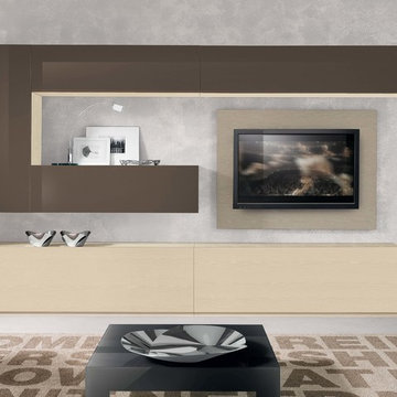
Modern Wall Unit VV 3926
Made in Italy
Perfect for both modern and contemporary styled interiors, this modular wall unit line offers lots of customization options so everyone could adjust the composition according to the individual's size and color requirements, creating an entertainment center of the dream. The wall unit line features lots of different units, that are available in several sizes and can wall mounted both vertically and horizontally. All the units from this entertainment center furniture collection are available in walnut, white ash, ivory ash and mink ash wood structure finishes as well as white and mud high gloss lacquers. The structure and the front doors of the same unit can be ordered in different finishes/lacquers to add unique and elegant contrast look to the wall unit design.
Features:
E1-Class ecological panels, which are produced exclusively through a wood recycling production process
The structure and the front in wood finishes are made of chipboard
The lacquered structures and fronts are made of REAL POLISH SCRATCH PROOF LACQUERING, which is non toxic and non allergic products
All the panels are 0.7" thick
Drawers mounted on metal runners with MDF bottom panel, height adjustable and soft-close system
Metal snap-on hinges with adjustable height
The starting price is for the VV Wall Unit Composition 3926 as shown in the main picture in Mink Ash / Ivory Ash / Mud Lacquer finishes. (Consists of: Two Base Drawer Cabinets H17.7" x W59" each, Two Horizontal Hanging Units W47.2" each, Horizontal Hanging Unit W59", Vertical Hanging Unit H47.2", TV Panel W47.2").
Dimensions:
Wall Unit: W120" x D18.3" x H74.8"
Individual Components:
Base Drawer Cabinet: W59" x D18.3" x H17.7"
Horizontal Hanging Unit: W47.2" x D13.8" x H13.4"
Horizontal Hanging Unit: W59" x D13.8" x H13.4"
Vertical Hanging Unit: W13.4" x D13.8" x H47.2"
TV Panel: W47.2" x D0.8" x H35.4"
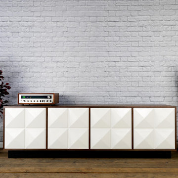
This modern credenza would make the perfect storage cabinet in nearly any environment. It is handcrafted by us here in the USA utilizing only the highest quality materials and it’s made to last a lifetime. It sits atop a black platform base (wrapped in vinyl to give a little texture). The raised geometric pattern of the doors add a touch of modernism. It is a very versatile piece and would be well-suited as a modern TV stand/console, credenza, buffet, or stylish sideboard.
Behind each door you’ll find an adjustable inner shelf for maximum flexibility. Push-to-open doors eliminate the need for handles or knobs on the front so as to not distract from the stylish, modern look of the doors.
In addition to making these in many different widths and heights, we can also build yours in nearly any configuration. Want a more “open”, “airy” look? We can make yours with an open middle section (meaning doors only on the outsides). Or, need drawers? We can do that as well!
It is shown here in rich brown walnut, but yours can be made in any of the woods shown on our wood options page.
Other door colors are available as well. For a more vintage look, consider our vintage orange doors. Or, for a more Hollywood glam look, go bold with our gold! See our other items for examples in different color and configurations.
Looking for a more mid-century look? Take a look at this unit with our tapered, gold spindle legs as opposed to the platform base.
For many years of trouble-free use, we use only top-of-the-line hardware (hinges, push to open mechanisms) from Blum and Salice. Only the highest quality furniture-grade veneers are used as well. Like any natural material, expect some slight variations in grain and coloration.
Using this to store electronic devices that need power? Let us know and we’re happy to add holes in the back for cables to exit for no additional charge.
Need a different width? Yours can be made with any number of doors.
Dimensions: approximately 82.75" wide x 19" deep x 25.25" high . (The dimensions are the exterior dimensions of the cabinet. The patterns on the doors will extend slightly past the cabinet)
Model: Regency (shown in walnut with white doors and platform base).
Please inquire for information and pricing on any changes you would like.
We also create many other custom pieces in this and other styles, so, please contact us if you are looking for conference tables, credenzas, industrial office shelving, or any other furniture. We would love to discuss how we can work together to design a unique piece to fit your needs!
To see more options and to learn more about us, visit us at: www.combine9.com
In addition to countless wonderful homeowners and small businesses around the country, some of our past clients include companies such as Google, Disney, Hilton Hotels, YouTube, Linked In, Living Social, Wyndham Hotels, Trip Advisor, Hard Rock Hotel & Casino, Vans Shoes, Vibram Shoes, Mishimoto, Starwood Hotels, and Bose retail stores. We’ve also been in numerous national publications and TV shows including HGTV’s “House Hunters”, a nation-wide Verizon TV commercial, a nation-wide Microsoft TV commercial, NBC’s “About a Boy” TV show, Dwell (for their Dwell Labs exhibit), Sound & Vision magazine, Living Spaces magazine, etc. We’ve even had several A-list celebrities (that we’ve been asked to not mention by name)!
ABOUT US: We create custom, unique furniture, unlike anything you will find. Our intention is to give you a piece of furniture that you will admire and enjoy for years to come and that will leave your house-guests envious. Our work is handcrafted in the United States and made to last a lifetime. These unique pieces fit perfectly with any urban/modern, mid-century, or rustic décor. All of our pieces can be made in many configurations and sizes to suit your specific style and needs. There are many options available as each piece is designed just for you, so, if you have any thoughts, please contact us and we would be happy to let you know what your options are.
* All rights reserved; Combine 9 Design, LLC
143